
Assignment from Instructor: In this visual project, you will demonstrate your understanding of color fundamentals and strategies. You are asked to develop an appropriate and effective color strategy for communications. Apply the color strategy in a real communication project (e.g. the typography-based poster). The preferred programs for this project are Adobe Photoshop and InDesign.
1. Complete the following steps:
- Take an original photo for inspiration.
- Adjust the photo in Photoshop (Color Adjustments).
- Use the eyedropper tool to select 3–5 colors from the photo.
- Identify the 3–5 chosen colors' relationship in a color wheel at color.adobe.com
- Import the color scheme to InDesign and apply the colors to the chosen project. Note that you don't have to use the type-based poster. You may use another project of yours.
2. Submit your work in PDF.
- Page one is your project in color.
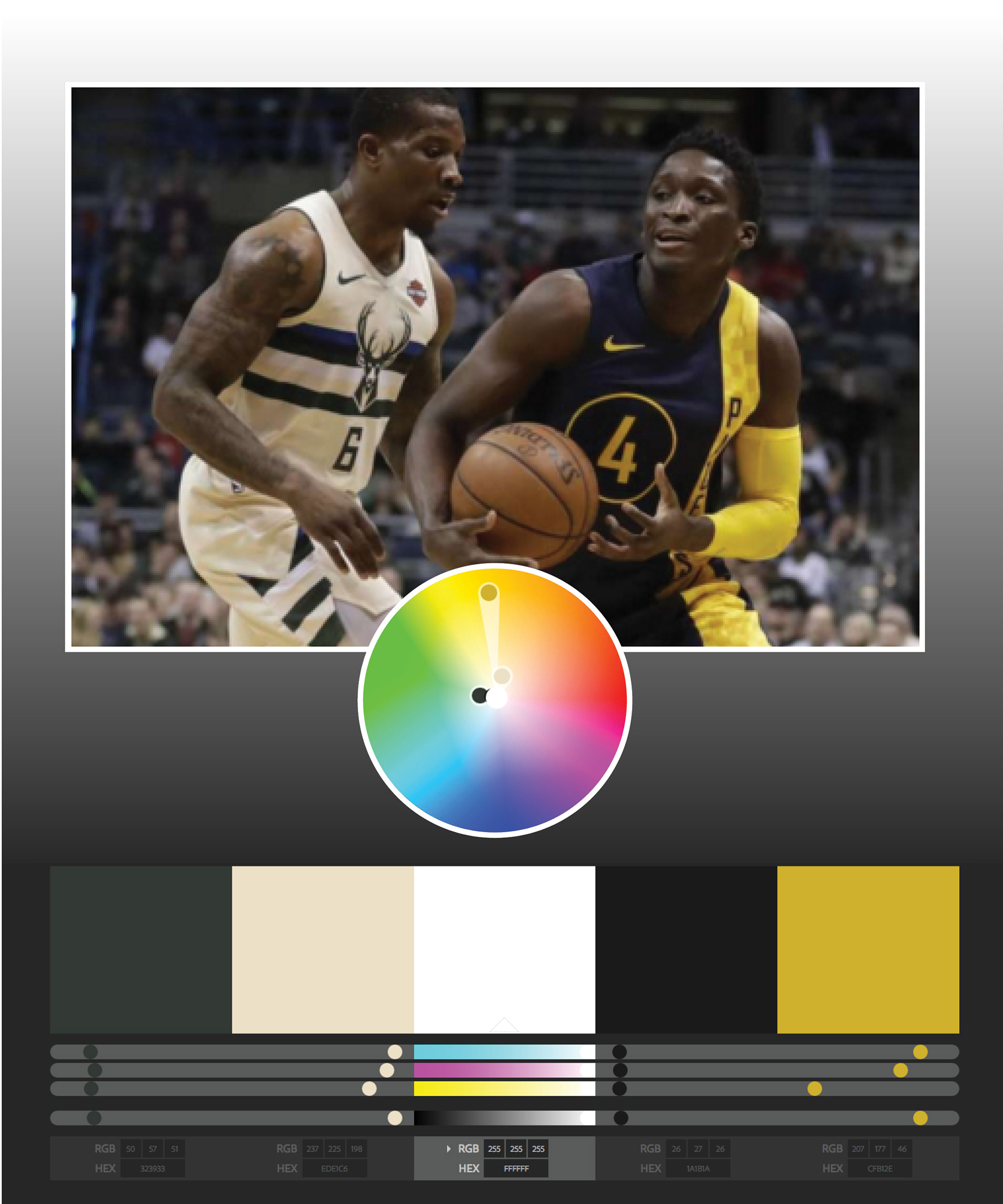
- Page two should include a screenshot of the color wheel from color.adobe.com and the original photo you used.
- Page one is your project in color.
- Page two should include a screenshot of the color wheel from color.adobe.com and the original photo you used.
----------------------
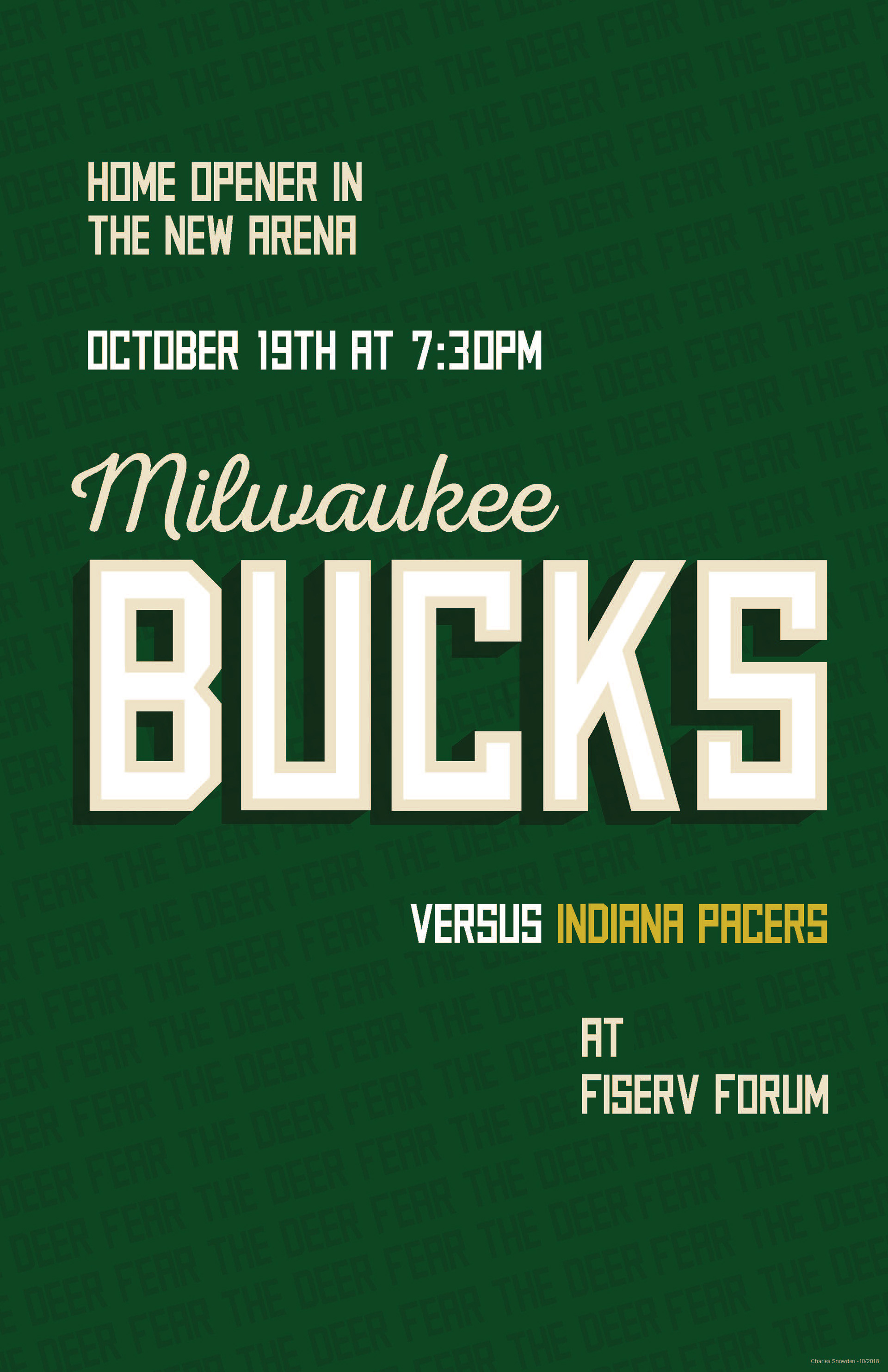
I used the typography-based poster from my last project. To get the colors for this project, I looked for an image from the Bucks and Pacers game last season. The good thing is that the Bucks wore their alternate cream uniforms for this game. Milwaukee’s nickname is the “Cream City.” I wanted to use cream in the poster as a secondary color. The Bucks primary color is green and I added the Pacer’s yellow for contrast.
Color Strategy

Poster
Visual Communications (MPDC-520-102) from Georgetown University's Master's in Design Management & Communications