
Assignment from Instructor: As you are going through the trainings, make sure that you are solid in the following skill areas:
• Photo straightening
• Color adjustment
• Image saving
• InDesign document setup
• Image and text arrangement
• Document saving
• After learning the design principles, can you practice using those principles to improve the design of a logo?
• In the previous discussion, you practiced identifying when a visual message aligns (or not) with important visual principles. You also offered suggestions for ways to improve the design. In this activity, you will actually make some suggested improvements - specifically to this logo.
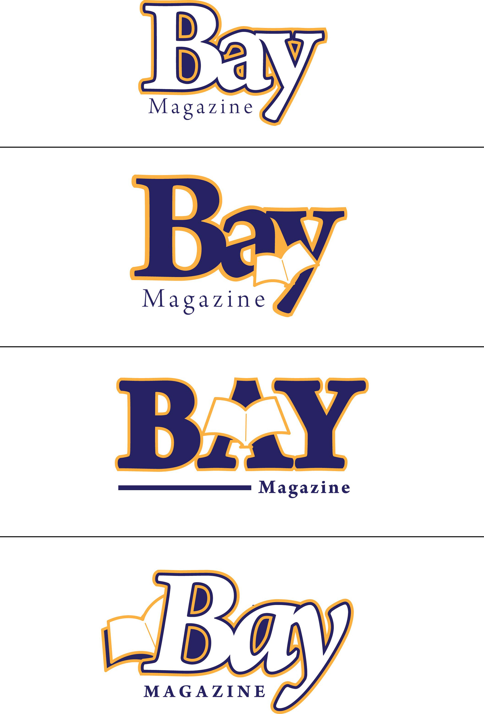
• First, take a look at the logo:
• Photo straightening
• Color adjustment
• Image saving
• InDesign document setup
• Image and text arrangement
• Document saving
• After learning the design principles, can you practice using those principles to improve the design of a logo?
• In the previous discussion, you practiced identifying when a visual message aligns (or not) with important visual principles. You also offered suggestions for ways to improve the design. In this activity, you will actually make some suggested improvements - specifically to this logo.
• First, take a look at the logo:
Bay Magazine
• Take time to reimagine the logo, basing your design choices on the visual principles you’ve learned about - and any other experience you have in the field. You might need to go through multiple drafts. You can use an Adobe program or just sketch your idea on paper and upload a photo of it. When you are ready to share your work, upload your redesigned logo, along with a brief explanation of what guided you in your process. Just like in other discussions, please post your work by Thursday of this week so your peers have time to respond.
----------------------
I wanted to keep my logo designs clean and simple. I chose a serif font for better readability. The strokes around the letters were added to give it a kick. On the bottom three logos, there is the imagery of an open magazine. I wanted the magazine image to be subtle and not pop as much.
Visual Communications (MPDC-520-102) from Georgetown University's Master's in Design Management & Communications