
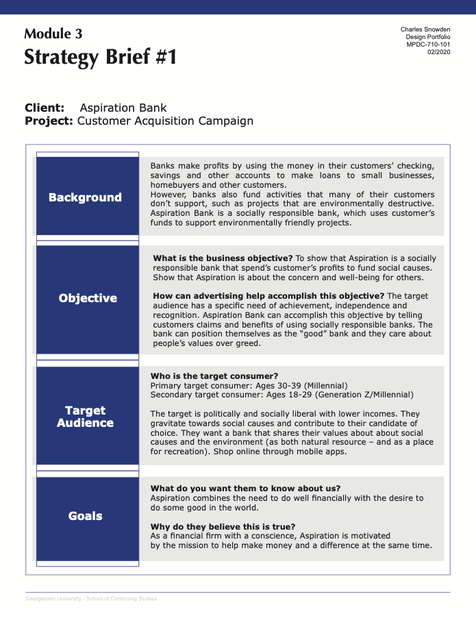
Assignment from Instructor: In this assignment, you will refer to your Strategy Brief #1 assignment and develop a creative campaign based on the brief. If you’d like, you can edit your brief based on your discussion with your classmates. If you do end up making edits, please turn in your revised brief with your creative campaign.
You will have all three weeks of Module 4 to develop the campaign, though be aware that we will engage in a creative review in the second week of the module. You’ll have to bring 4-5 rough ideas for the campaign to that discussion, so I recommend that you get started early.
This campaign will be featured in your design e-portfolio, so put forth the requisite effort. For the campaign, I’d like for you to develop three different creative products:
1. Print Ad | 2. Internet Banner Ad | 3. Facebook Post
1. Print Ad | 2. Internet Banner Ad | 3. Facebook Post
----------------------
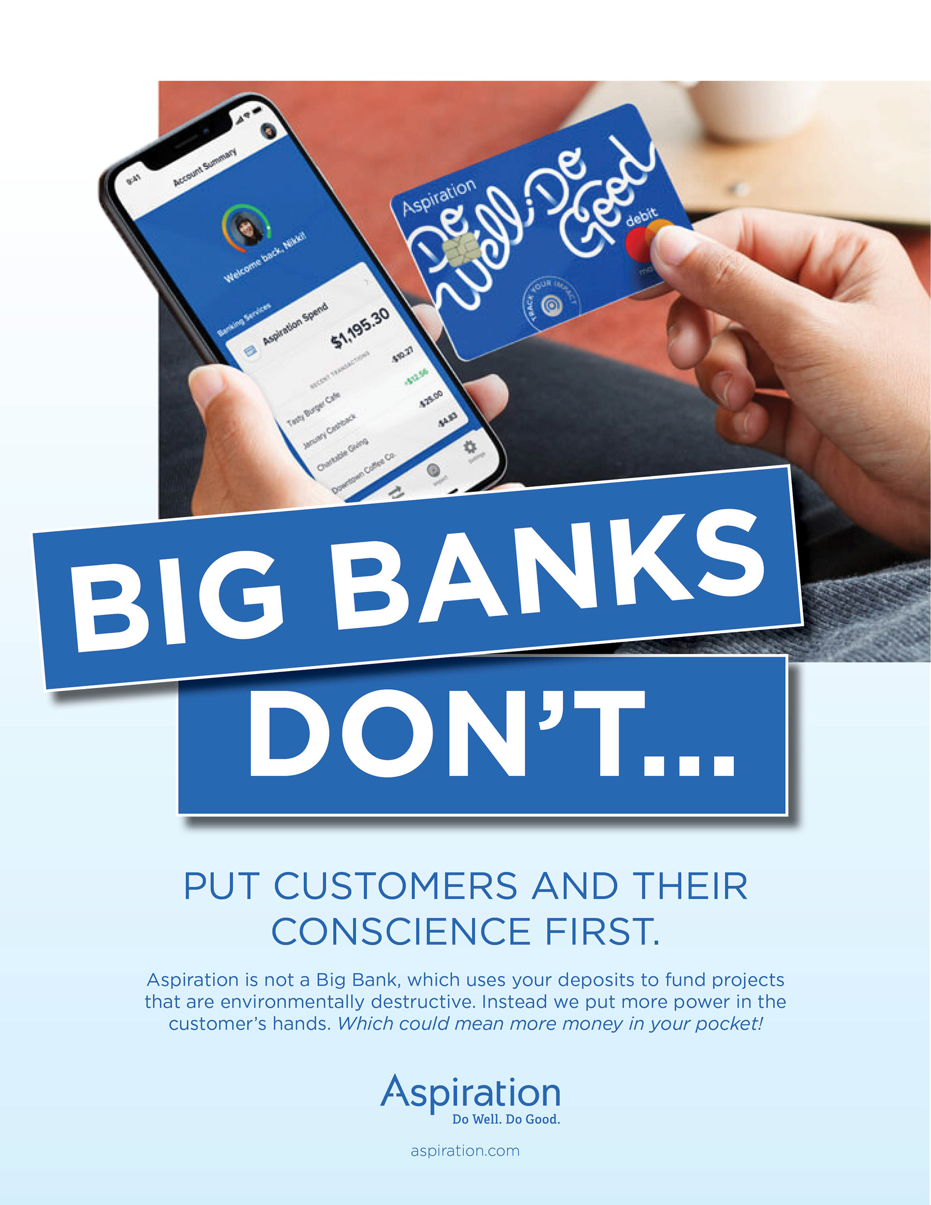
These pieces could be used as print media in magazines and on digital media platforms. The print Images would be placed in universities or in businesses such as coffee shops or gyms. A lot of people search the web using their cell phones. Social media is another way Aspiration can promote the bank with different advertisements. In my creative brief, I mentioned how I wanted to show how Aspiration is a socially responsible bank. All four of my campaigns talk about how Aspiration cares about the customer. I used the headline to get the customer's attention with an overstatement. I feel this will better position Aspiration with the target audience In a few ads, I focused on how it differs from other banks.
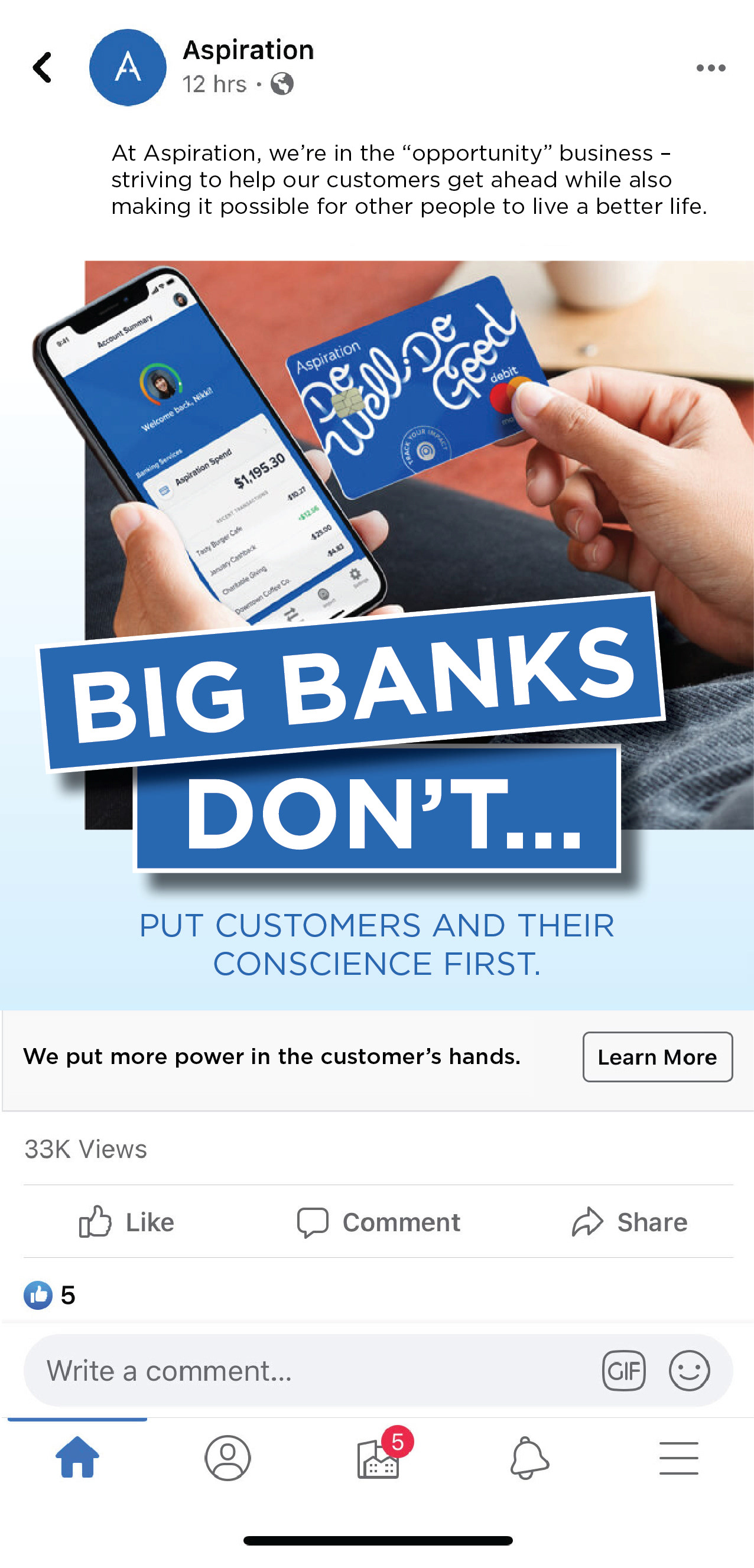
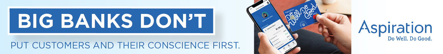
My goal was to use hierarchy, having the viewer go from top to bottom. "Big Banks Don’t…," gets the viewer's attention The type is a focal point. To make the headline pop, I used shapes with a drop shadow behind the type. I used a powerful image to draw in the viewer. I also adjusted the headline to make the ad stand out.
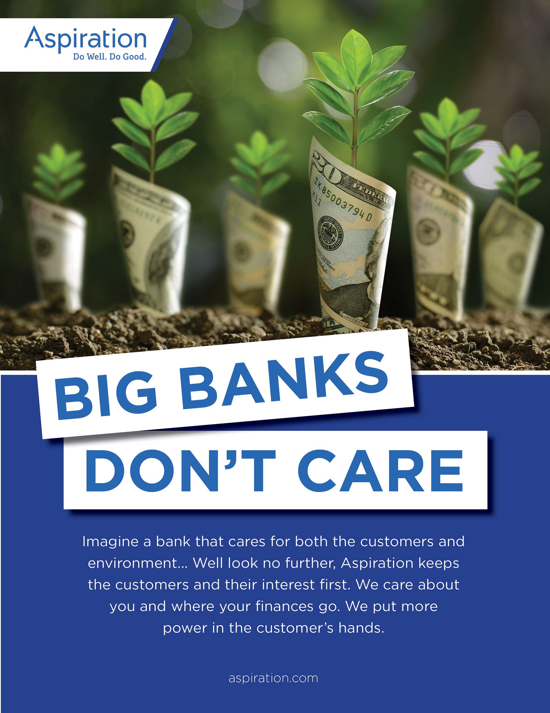
Print Ad
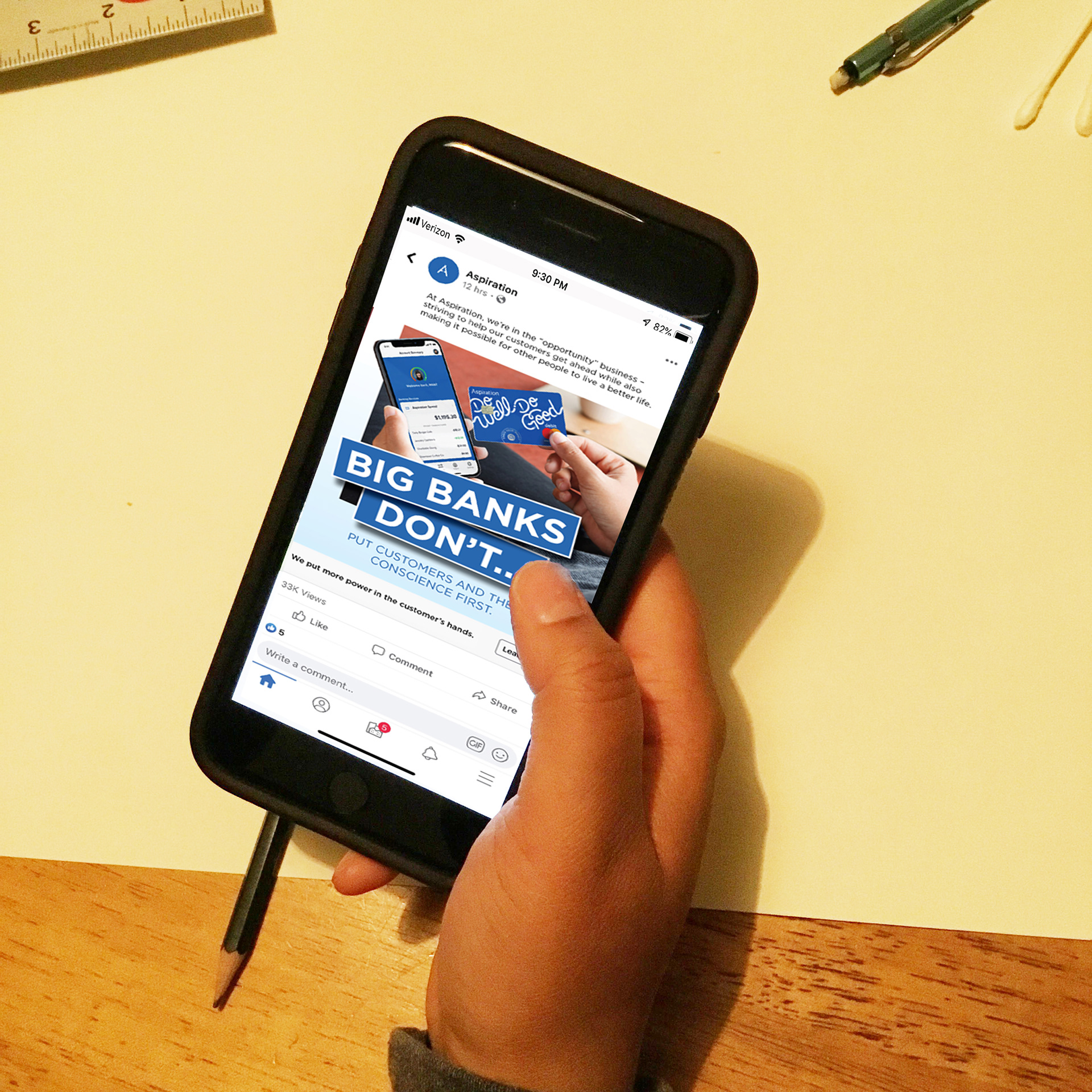
Facebook Post
Web Banner
------------
Rough Ideas
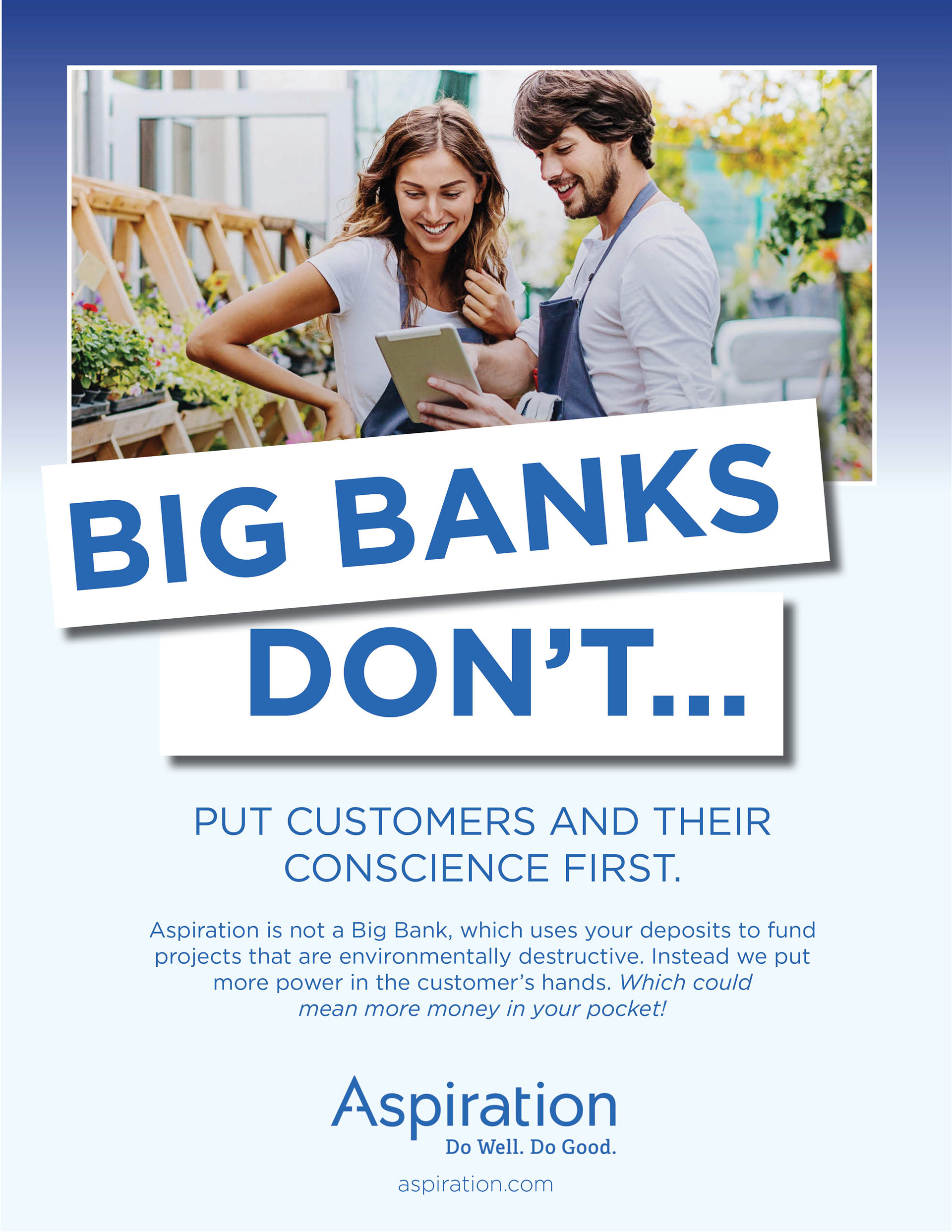
Big Banks Don’t… - The second ad uses type as a focal point. To make the headline pop, I used shapes with a drop shadow behind the type.
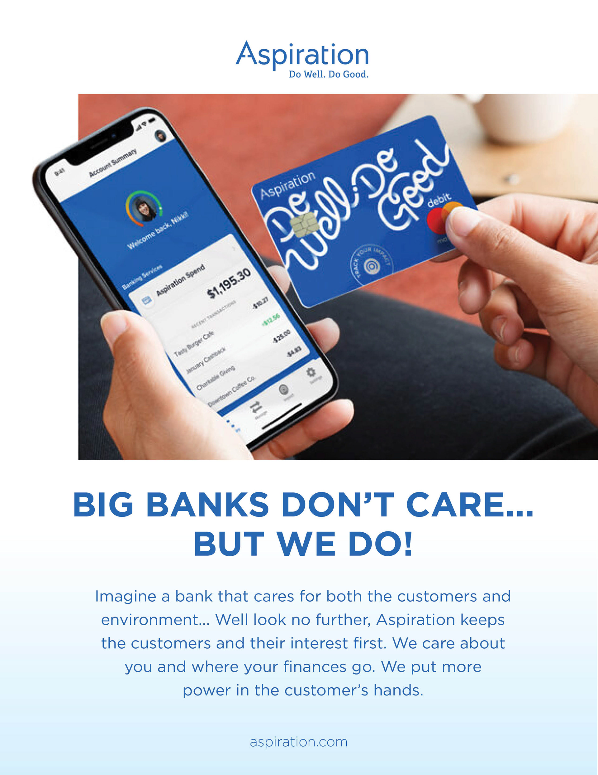
Big Banks Don’t Care But We Do! – My third campaign doesn’t feel as powerful as the other three. I used imagery showing what the bank offers. The copy could probably be improved to describe what’s happening in the image.
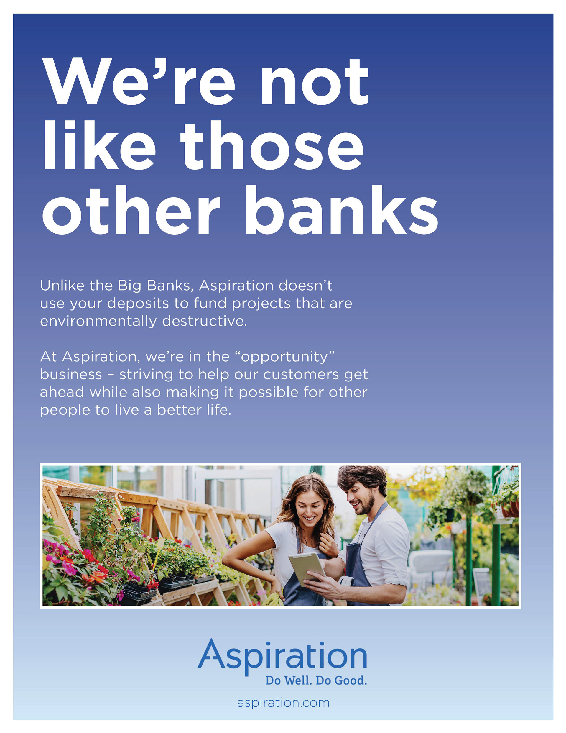
Big Banks Don’t Care - The fourth ad is probably the best one. It might connect more to the target audience. I used a powerful image to draw in the viewer. I also adjusted the headline to make the ad stand out.
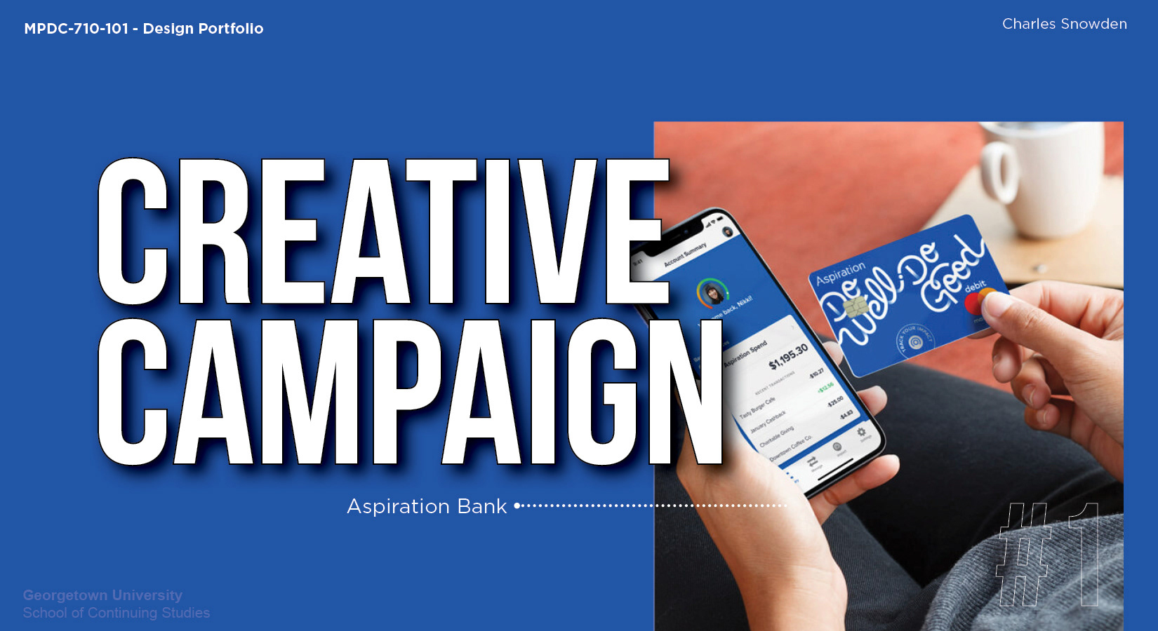
Design Portfolio (MPDC-710-101) from Georgetown University's Master's in Design Management & Communications