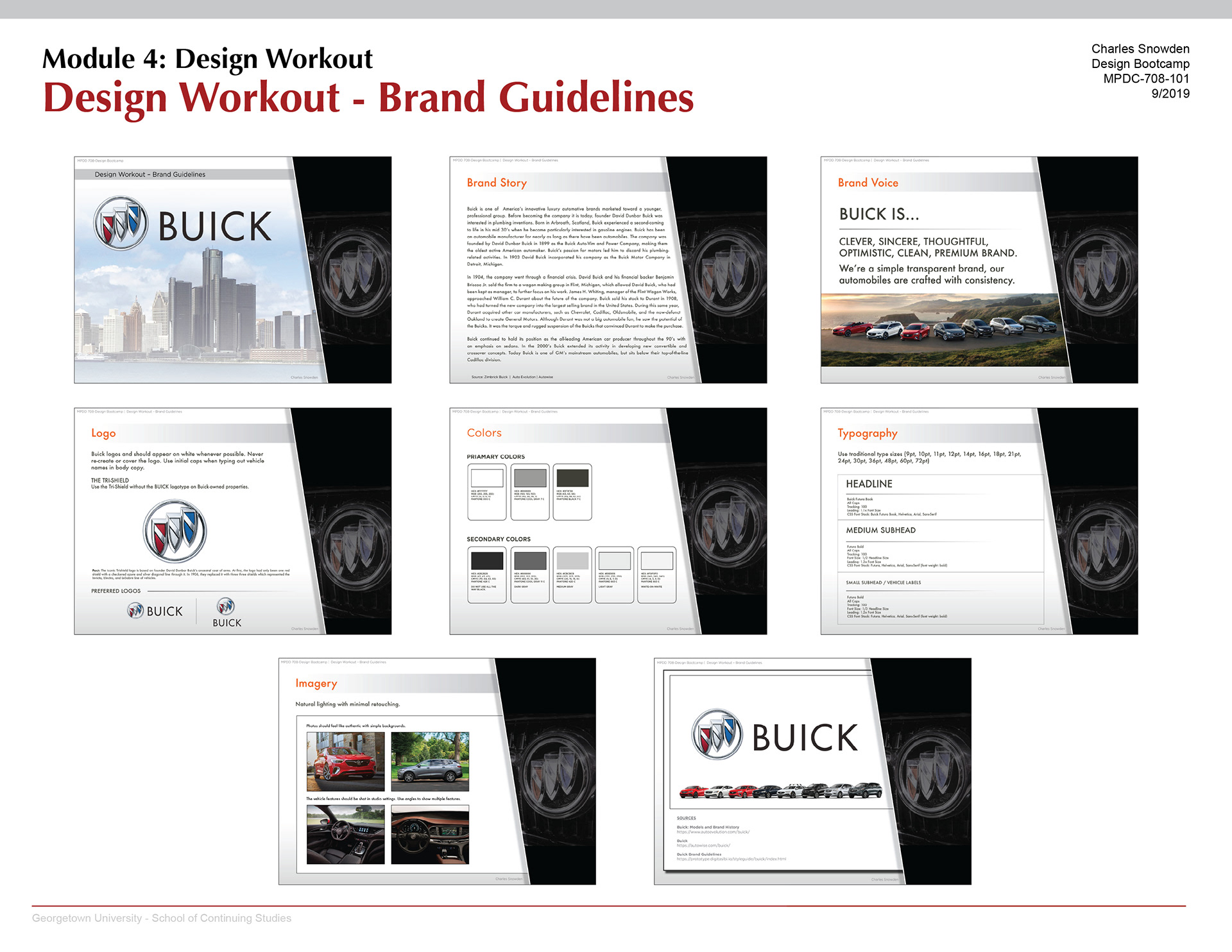
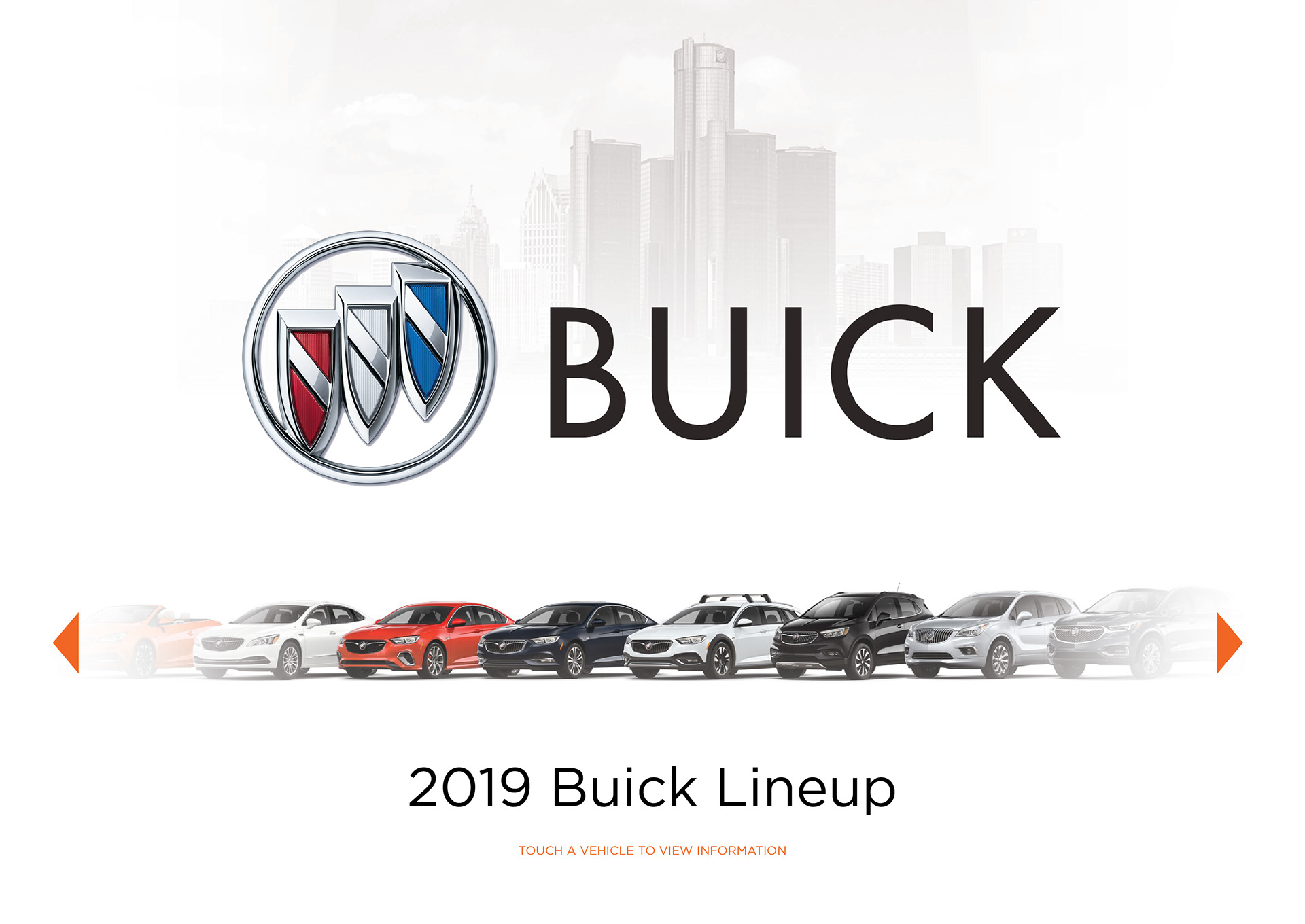
Buick Brand Project
Design Workout Assignments
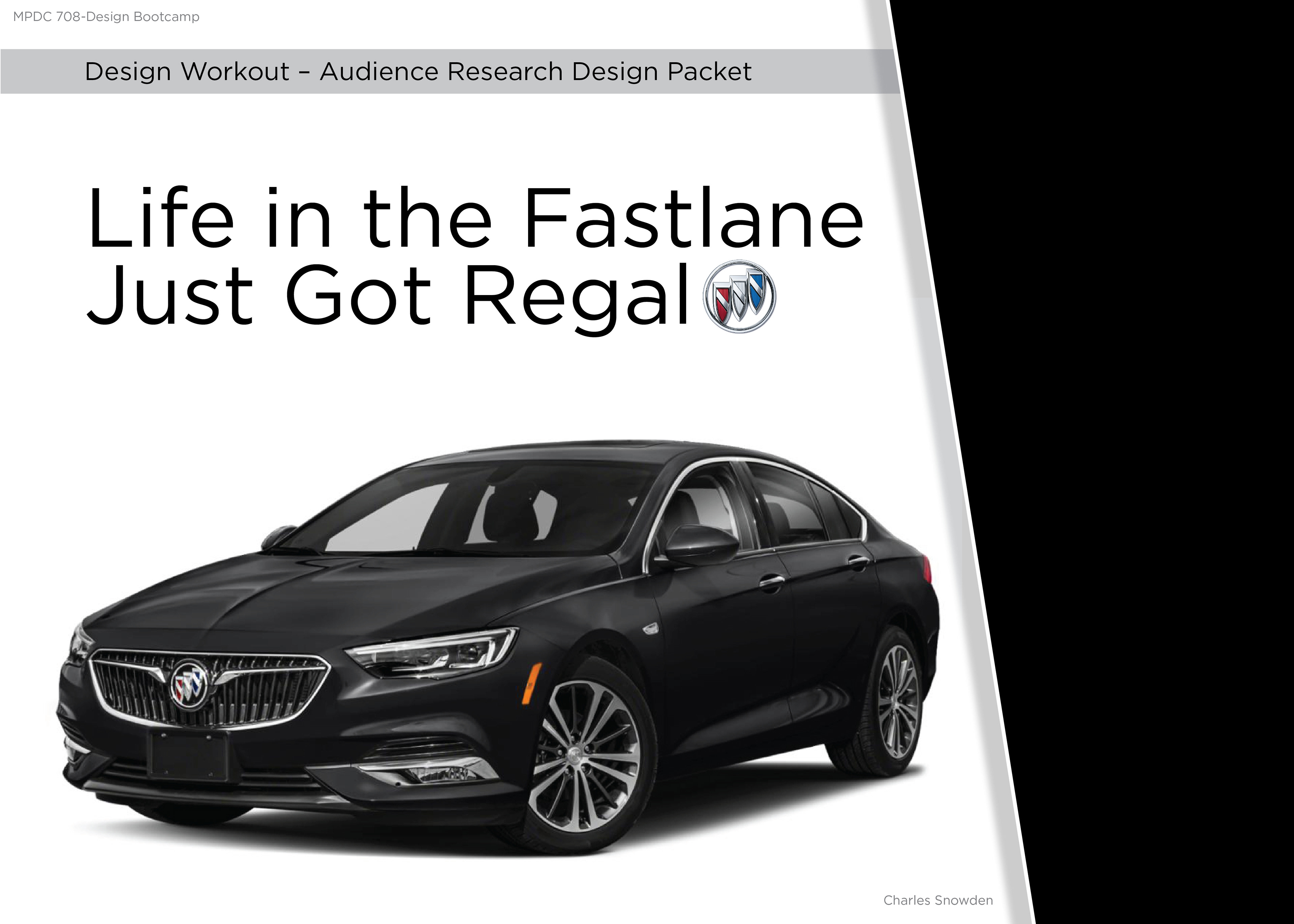
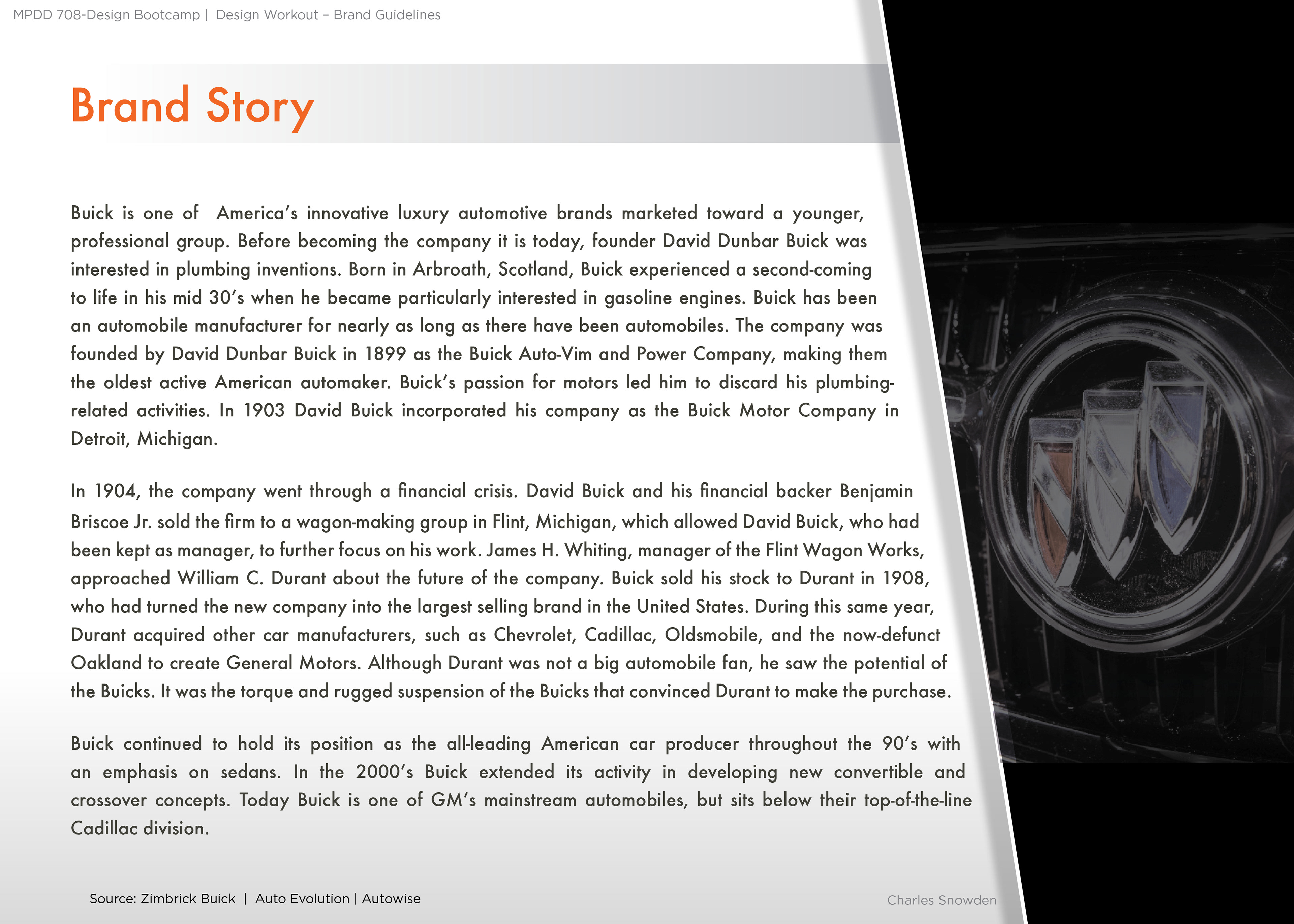
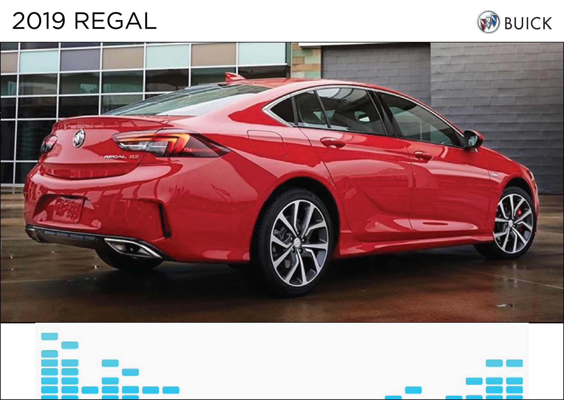
This is some of my work from my time at Georgetown University’s Design Management and Communication program. During the semester, each student picked a go-to brand. The brand I chose was Buick, specifically the Regal. There’s a slight connection between Buick and me. The first car I ever had was a 1995 Buick Regal Gran Sport. Growing up the brand was a popular car. When I would drive around Milwaukee people at stoplights would ask, “ Are you selling it?” When I drove my Regal I remember it being fast and reliable. Recently, I bought the newer model of the car. People comment on the Regal’s physical appearance. When I was growing up a lot of older men drove Buicks. The memories in this car were the inspiration for my project. I chose the Buick Regal, instead of focusing on the entire brand. Three projects I did this semester dealt with different phases of customer interaction, website design, social media and advertising. There was a lot of research involved in the creation of each project throughout the semester.
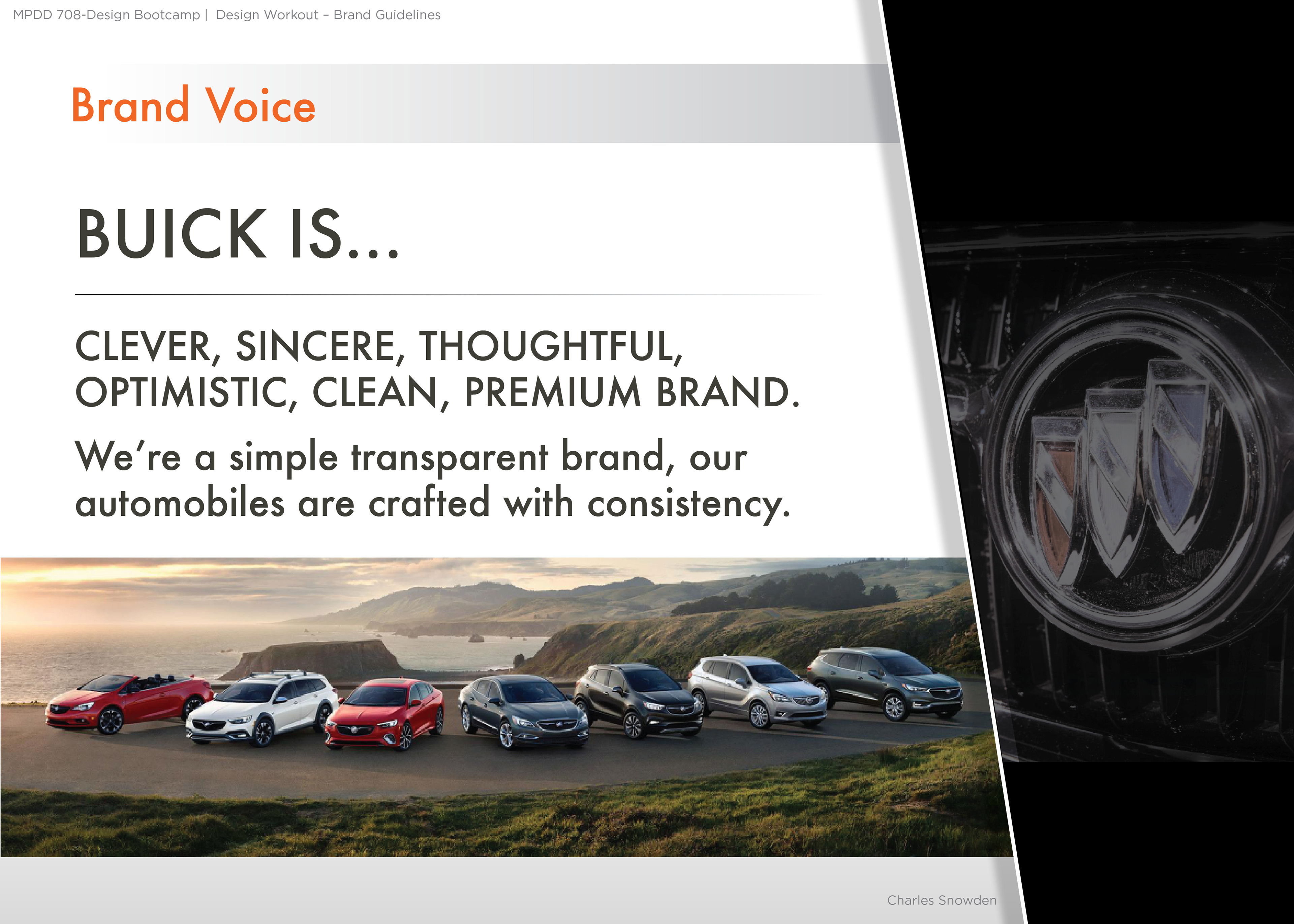
For years Buick was seen as an old-school brand that did not connect with younger audiences. A challenge the Buick design team faces is figuring out which trends and features will be in style in the next four years. One thing that Buick does well is stay ahead of the curve by thinking outside the box. The Buick brand was once known for creating groundbreaking designs. Consumers are starting to recognize Buick as cool and modern again.
Sidenote: Buick stopped making the Regal in the USA.
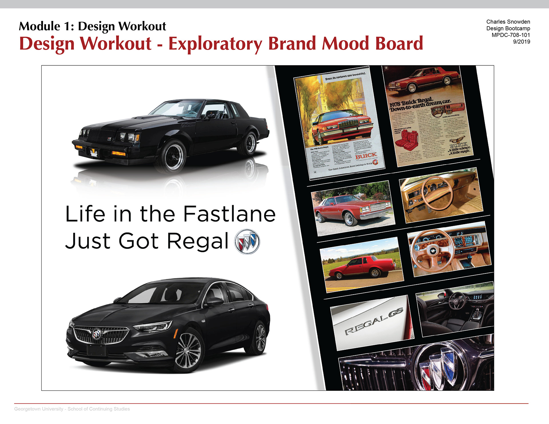
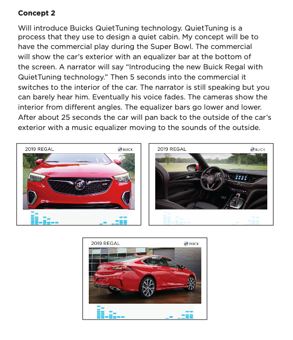
Buick is constantly evolving and shifting the personality of the brand. In my mood board I showed the evolution of the Buick Regal, by showing the past and present.
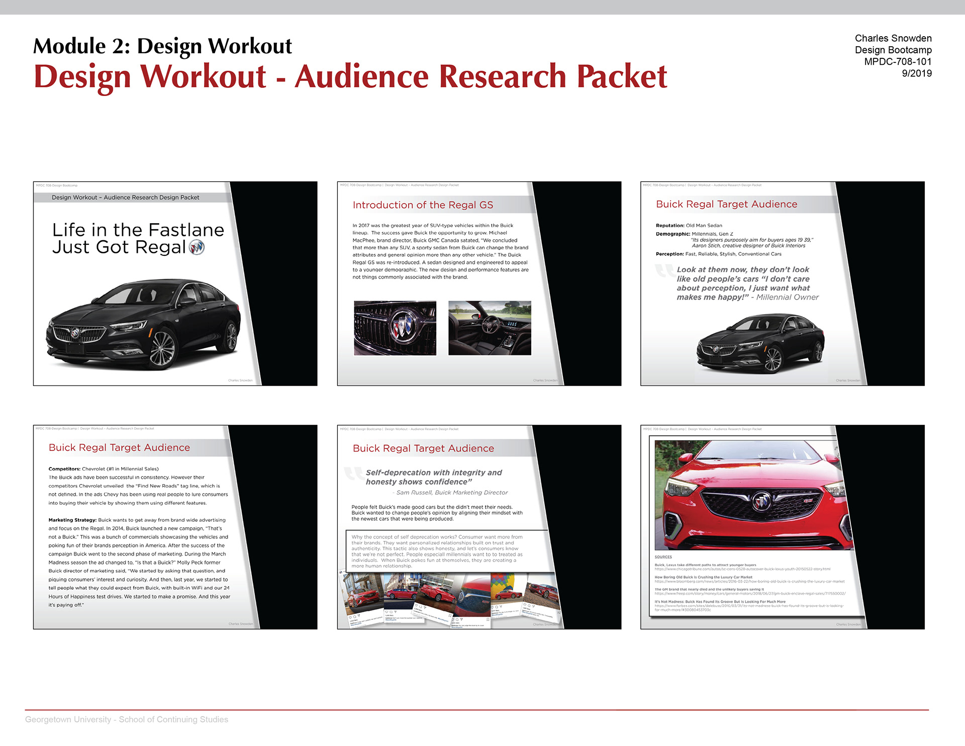
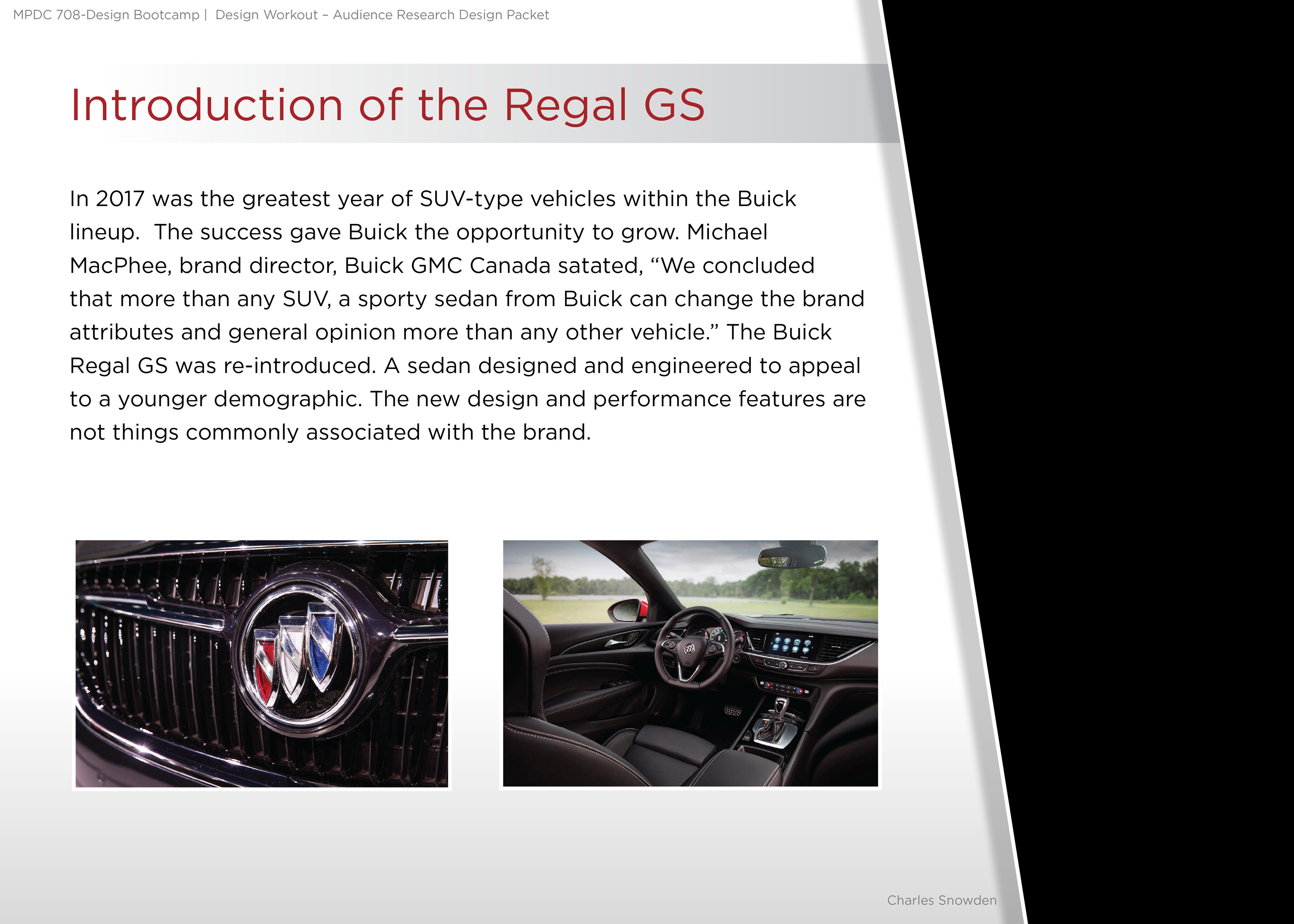
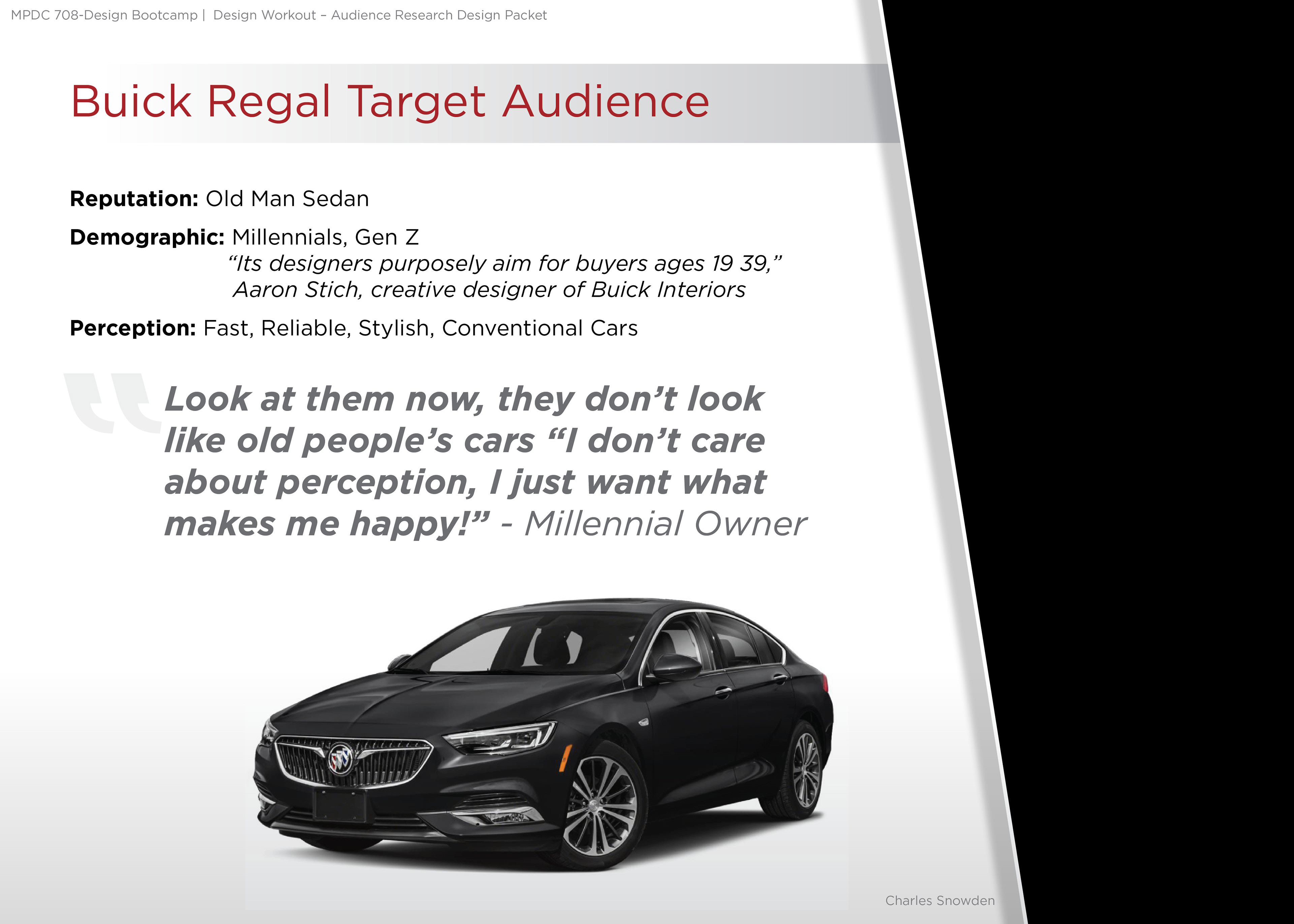
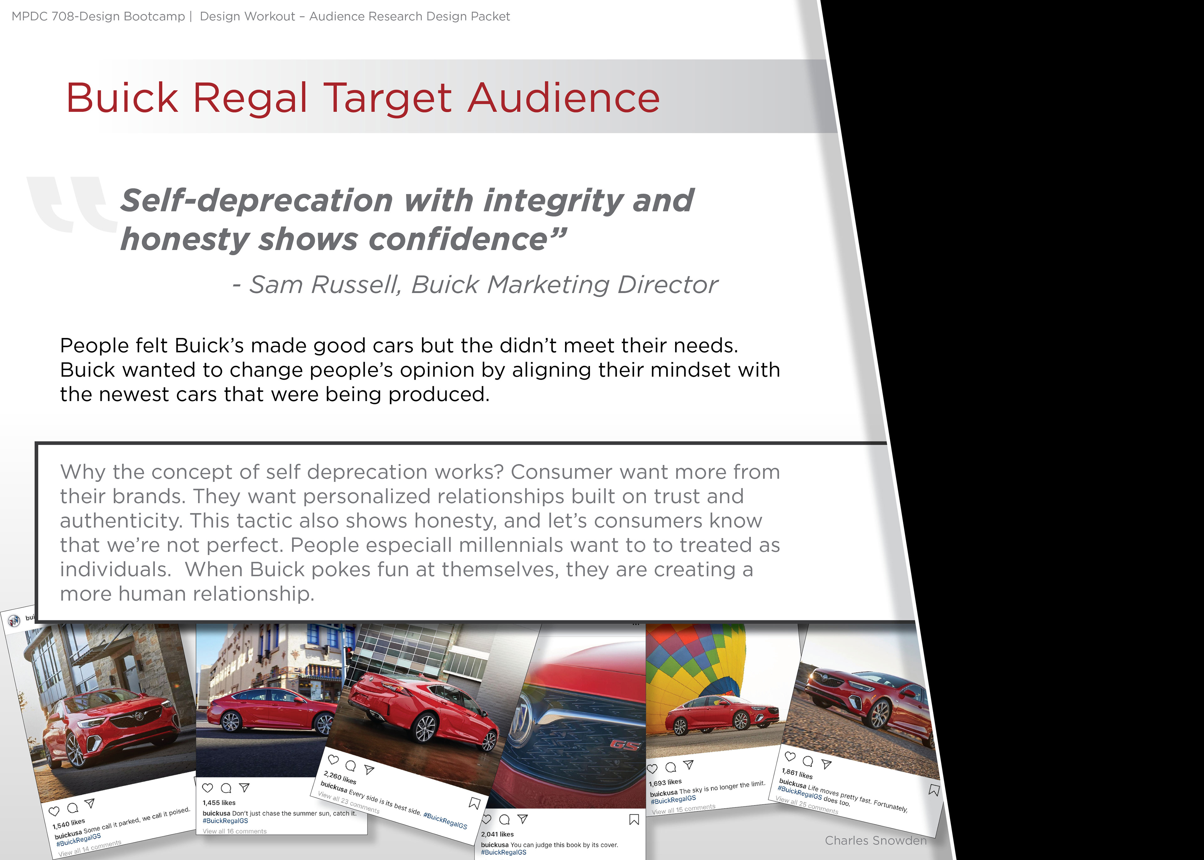
The Buick Regal GS was re-introduced. A sedan designed and engineered to appeal to a younger demographic. Known as fast, reliable, stylish, and conventional cars. The new design and performance features are not things commonly associated with the brand. Buick has the reputation of being called the old man sedan. They purposely aim for buyers ages 19-39. They use a tactic of self-deprecation mixed with integrity and honesty to show confidence
Why does the concept of self-deprecation work? Consumers want more from their brands. They want personalized relationships built on trust and authenticity. This tactic also shows honesty, and lets consumers know that we’re not perfect. People especially millennials want to be treated as individuals. When Buick pokes fun at themselves, they are creating a more human relationship.
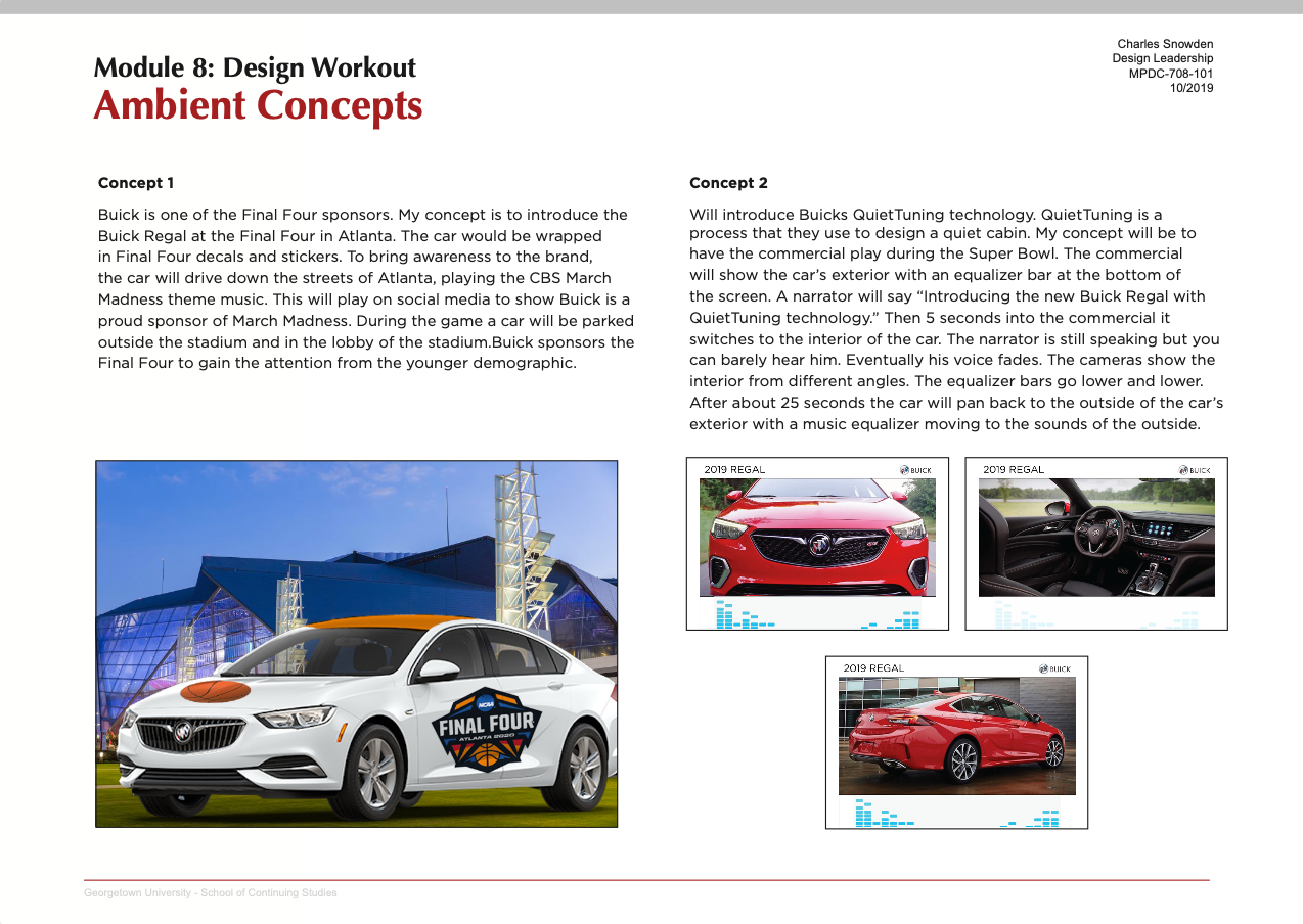
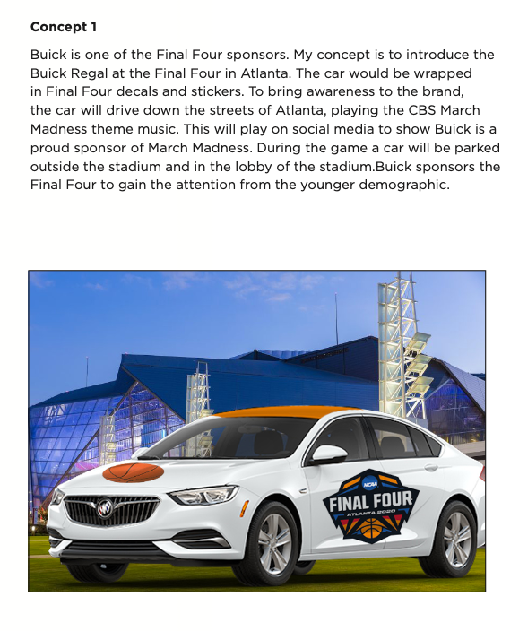
Click the images below for a closer look.

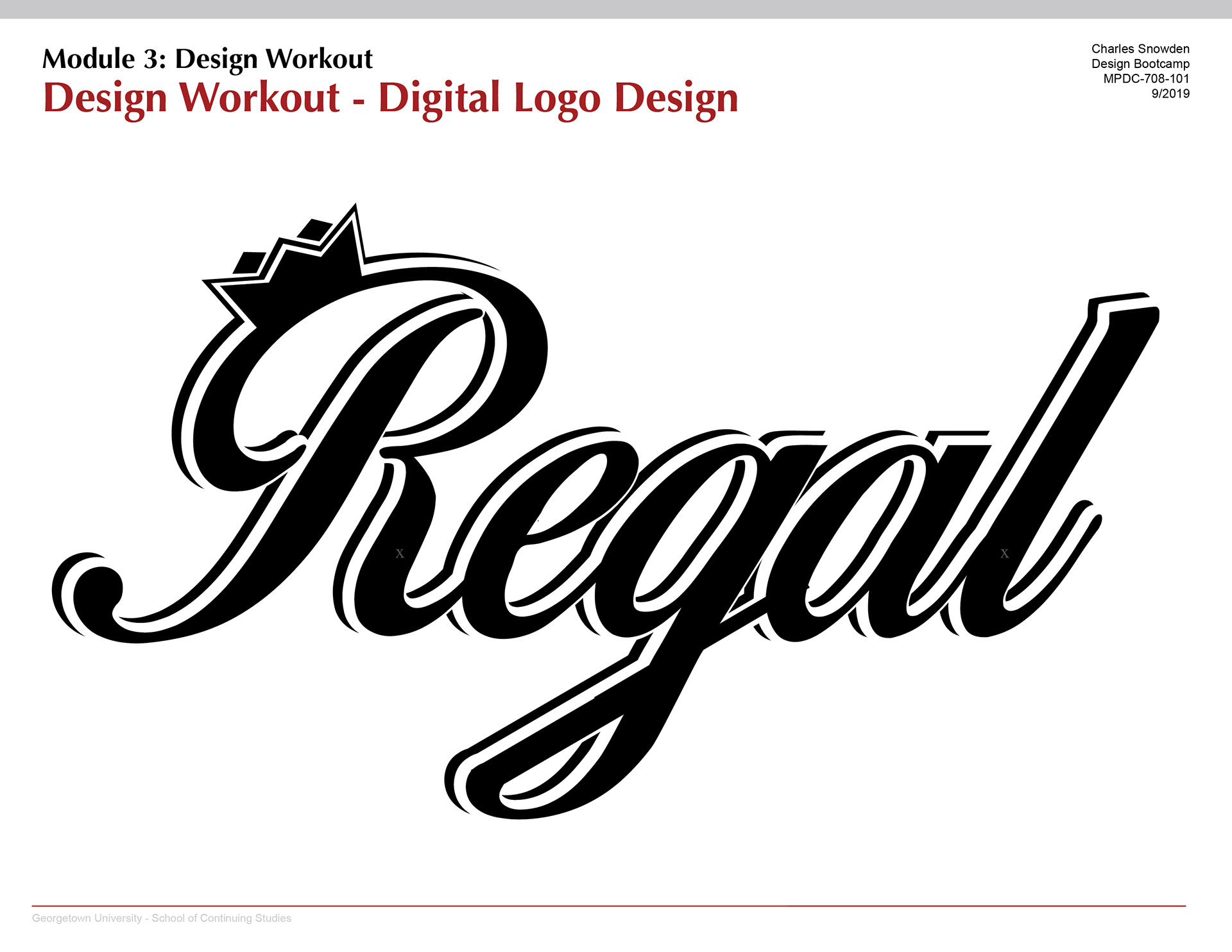
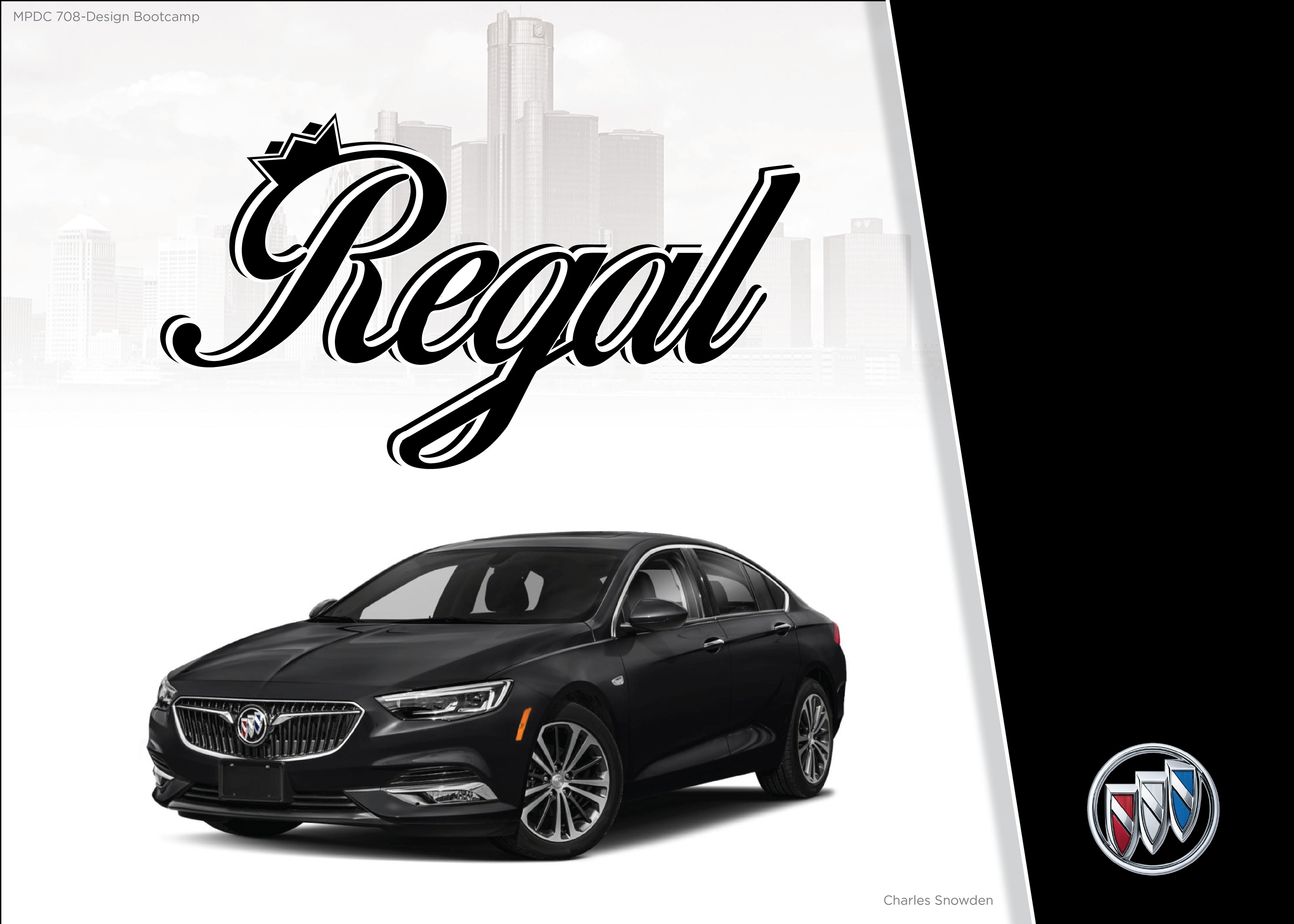
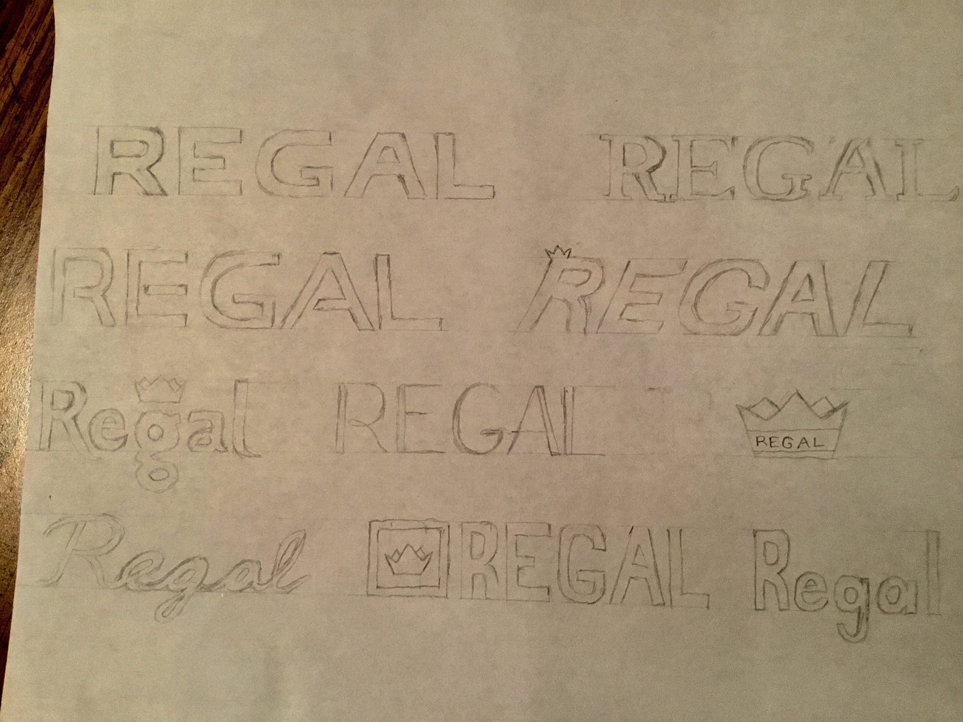
My final logo design for the Buick Regal. From the feedback, everyone liked the script and curve logo. I decided to use a script font to convey luxury. A lot of people associate "regal" with royalty and being noble. To play off the word, I added a crown to the logo.
I used some of the current guidelines for the use of text and images. I also highlighted the important aspects.
Click the images below for a closer look.
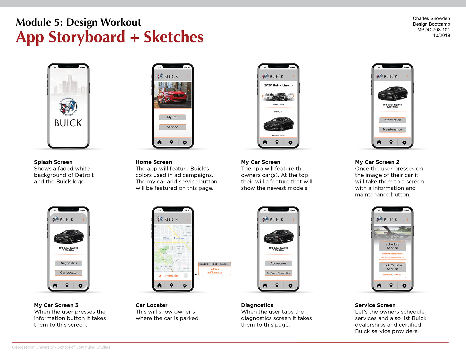
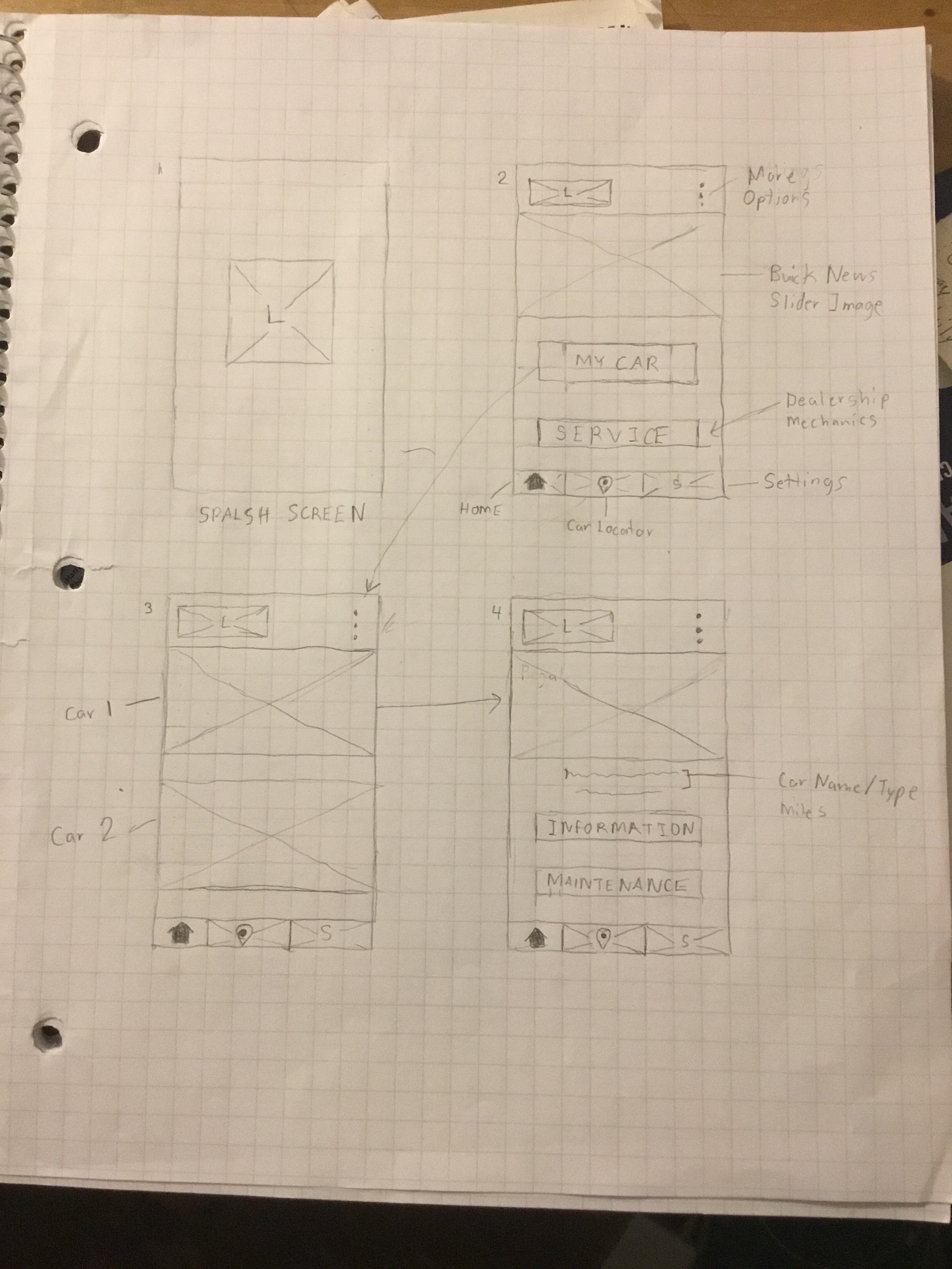
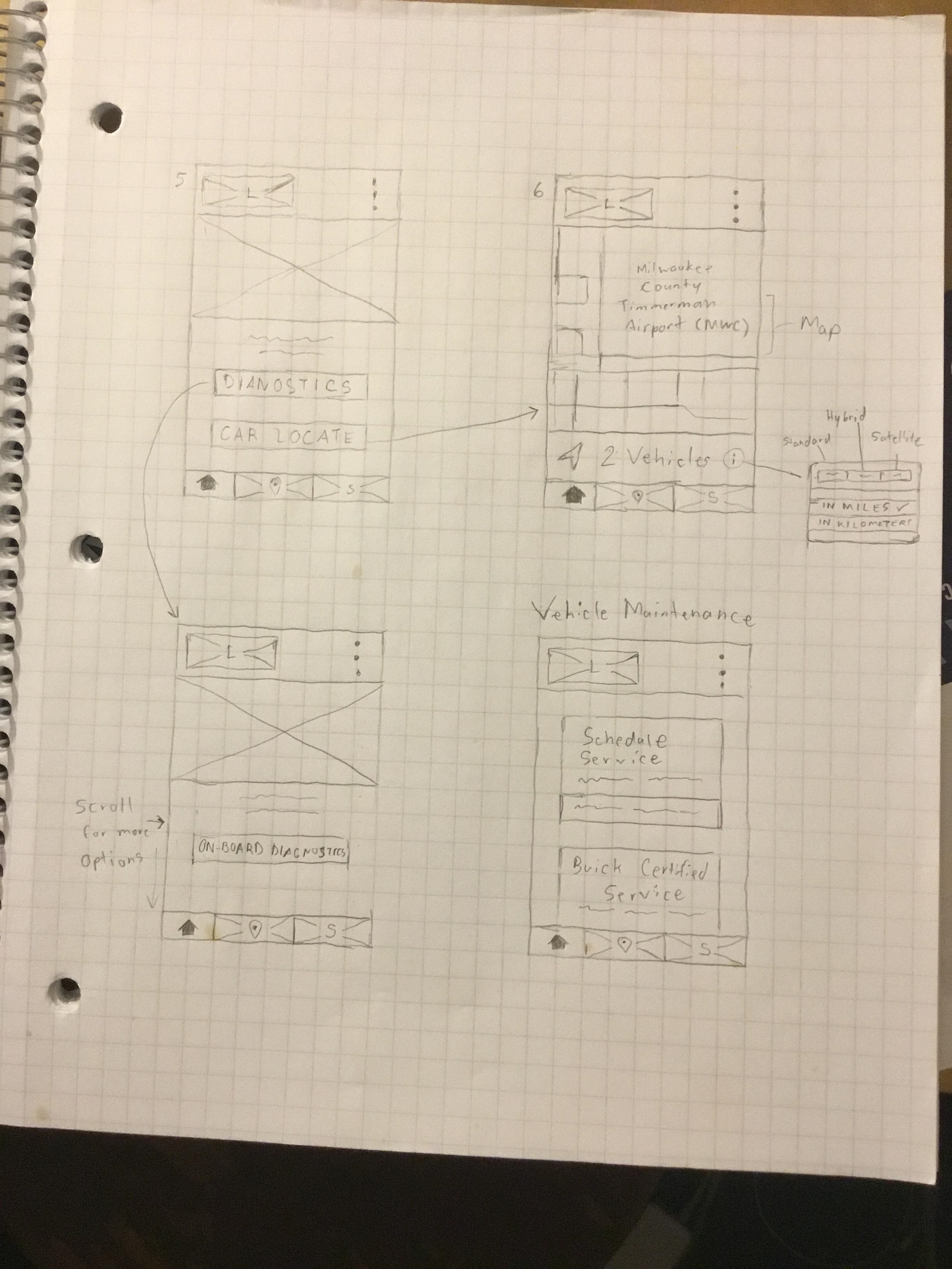
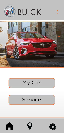
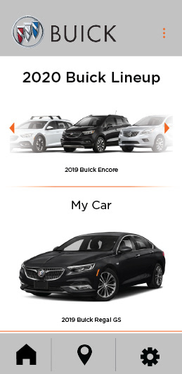
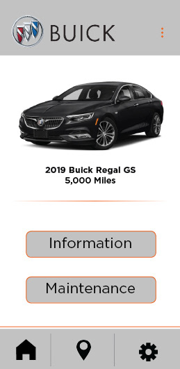
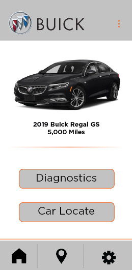
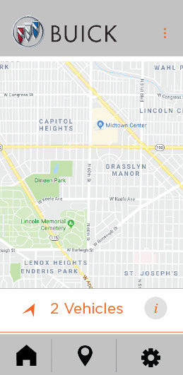
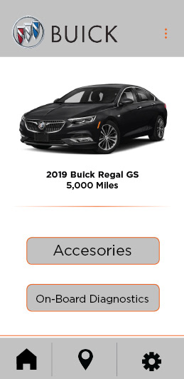
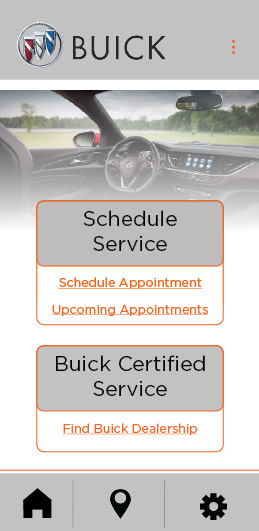
The main principles I wanted to focus on were customer satisfaction, learnability, and efficiency. The mobile app will be simplistic and functional. The current app is very functional but has a simplistic design. My app re-design will focus on aesthetics; making it visually appealing. Hoping this will increase customer satisfaction. The look and feel of the app are very important but a well-designed app is also functional. Having intuitive navigation and content prioritization will make this app easy to use. This app will allow Buick owners the ability to check and schedule maintenance appointments. It will also let them look at their car’s information.
Click the images below for a closer look.
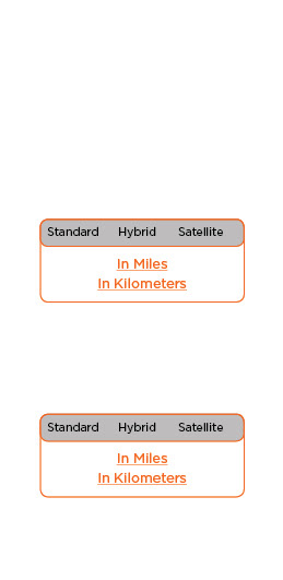
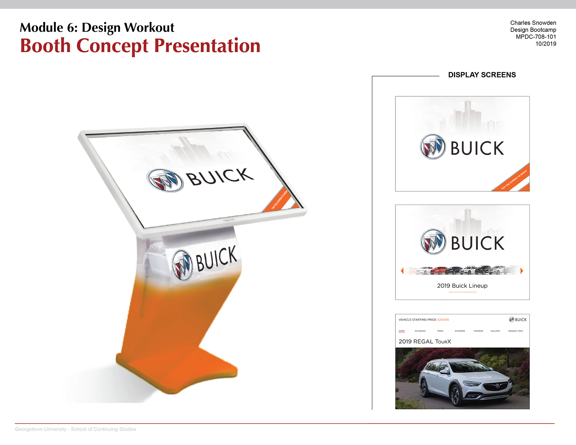
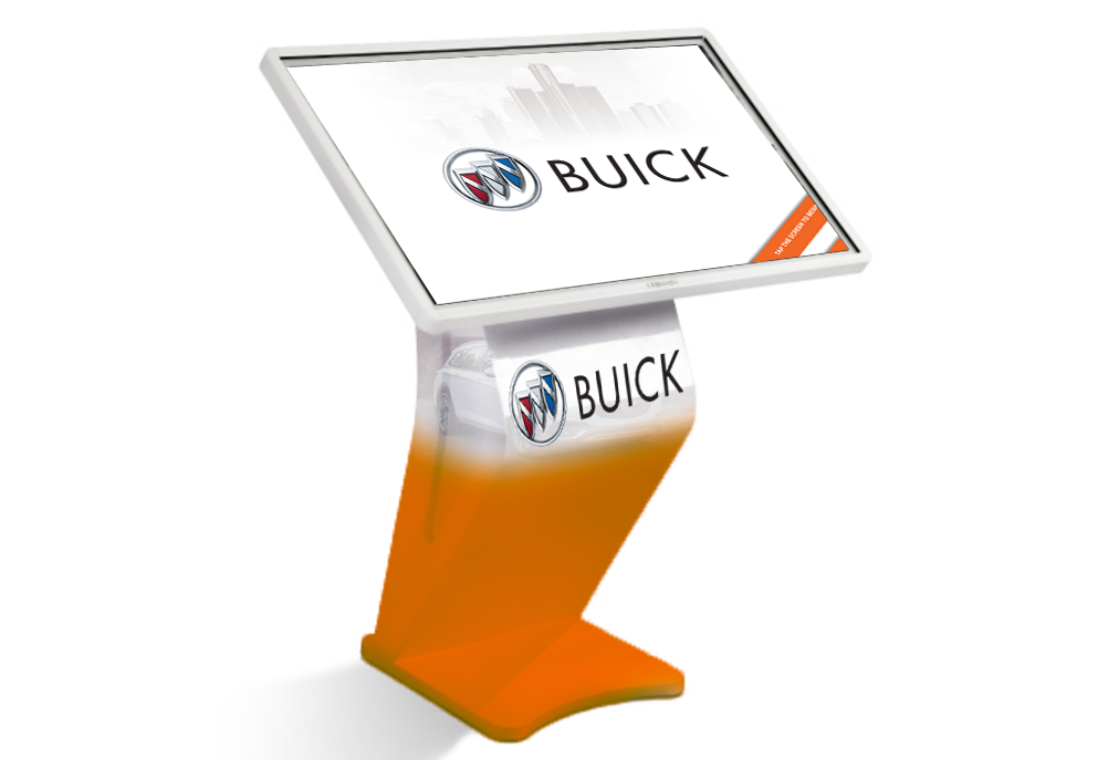
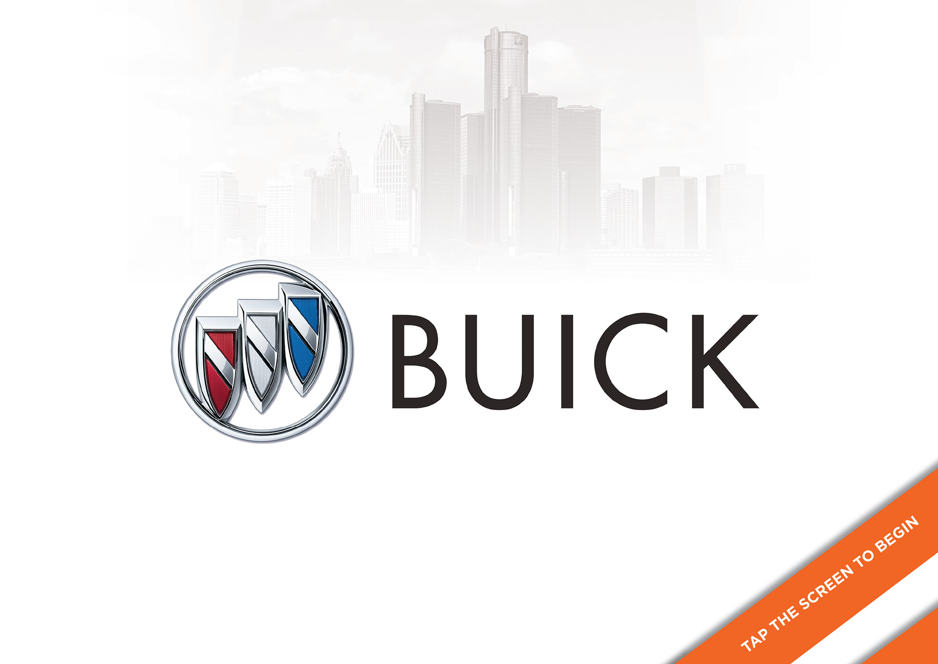
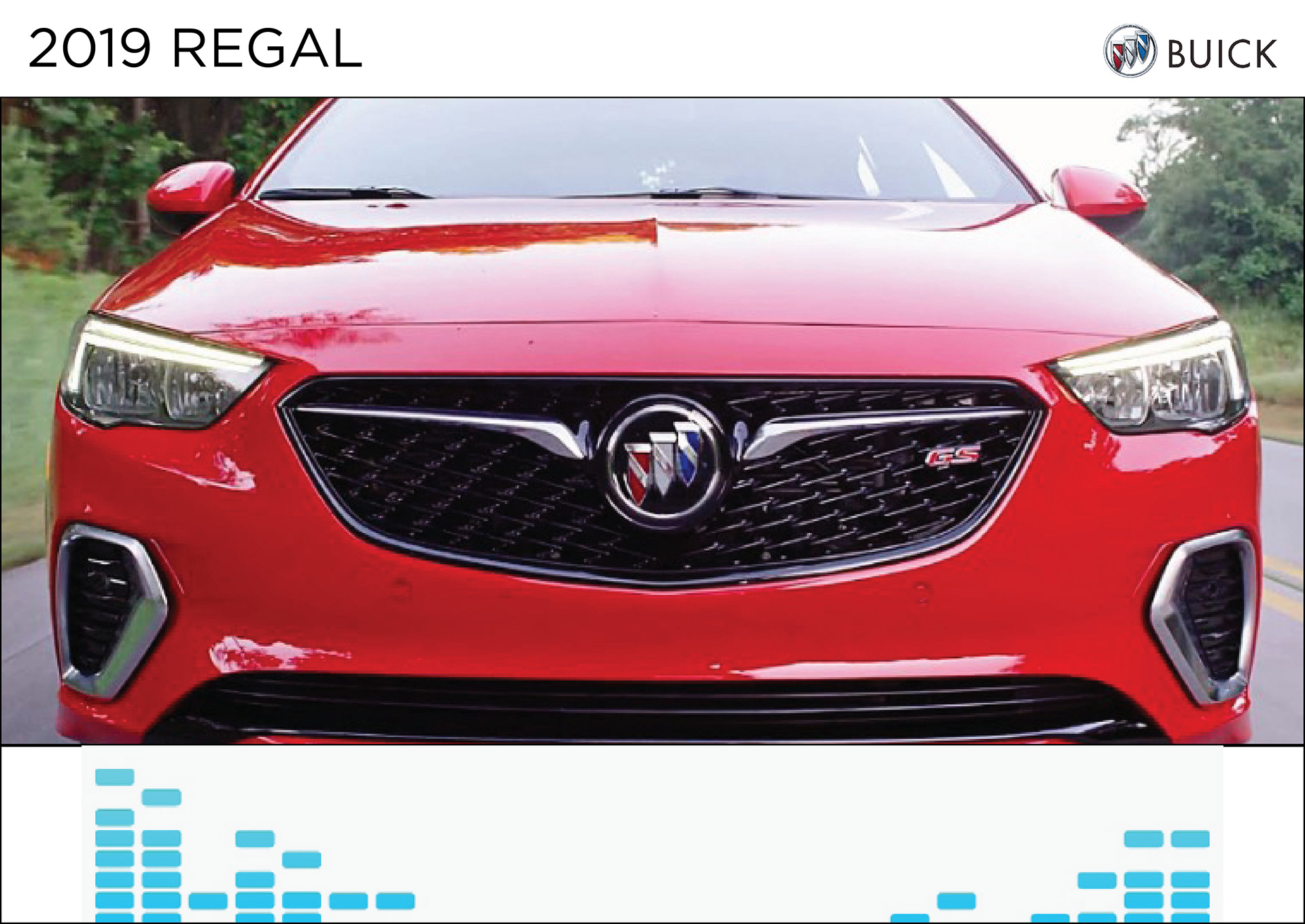
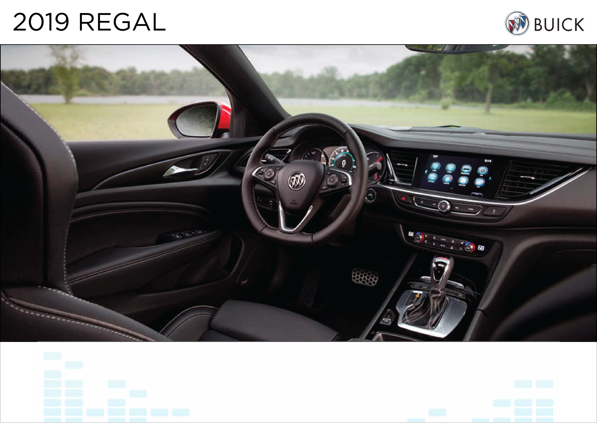
For my concept, I want to have people interact with the vehicles through interactive media. There will be video montages of the Buick vehicles in action on the road and happy people showing off the functionality of the vehicle. On a trip to Detroit a few months ago I noticed the GM vehicle displays at the Renaissance Center and how it was arranged. The car doors were unlocked to let people sit inside of them and get a closer view of the interior. GM representatives were on the floor and sitting at a desk to answer questions. One of the features was a touch screen kiosk device next to each GM vehicle being showcased. I walked up to the Buick Regal TourX and started playing with the kiosk. The same touch screen kiosk can be used in the booth display. If these touch screens had this effect on me then it can have the same effect on other people. This will help Buick consumers and car enthusiasts with more information about the new Buick line. This device will show 3D renderings of the car, the price, information, and its features. These devices can keep people occupied and they can also give the Buick representatives an opportunity to engage them. I used Buick’s secondary color at the bottom of the kiosk to make them pop.
Click the images below for a closer look.
Click the images below for a closer look.
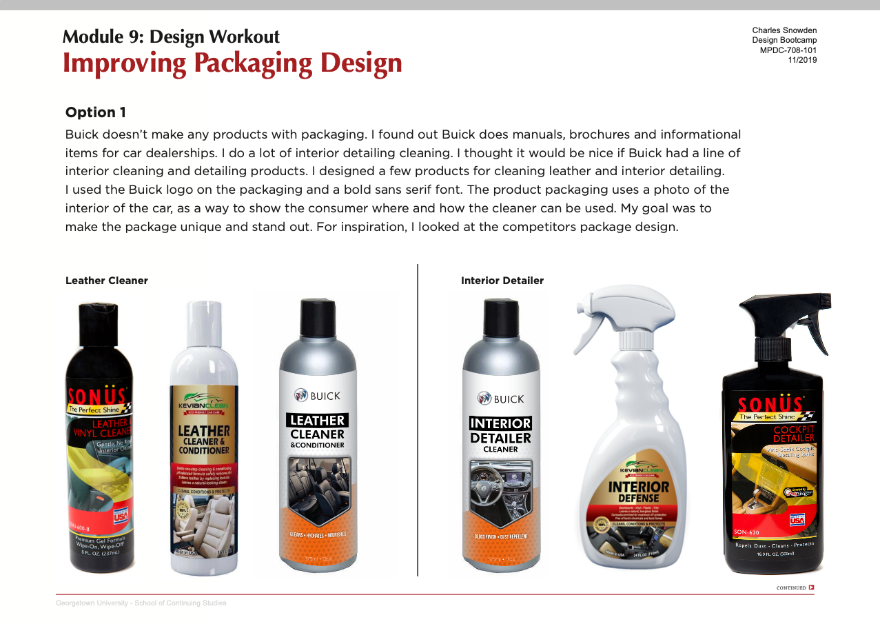
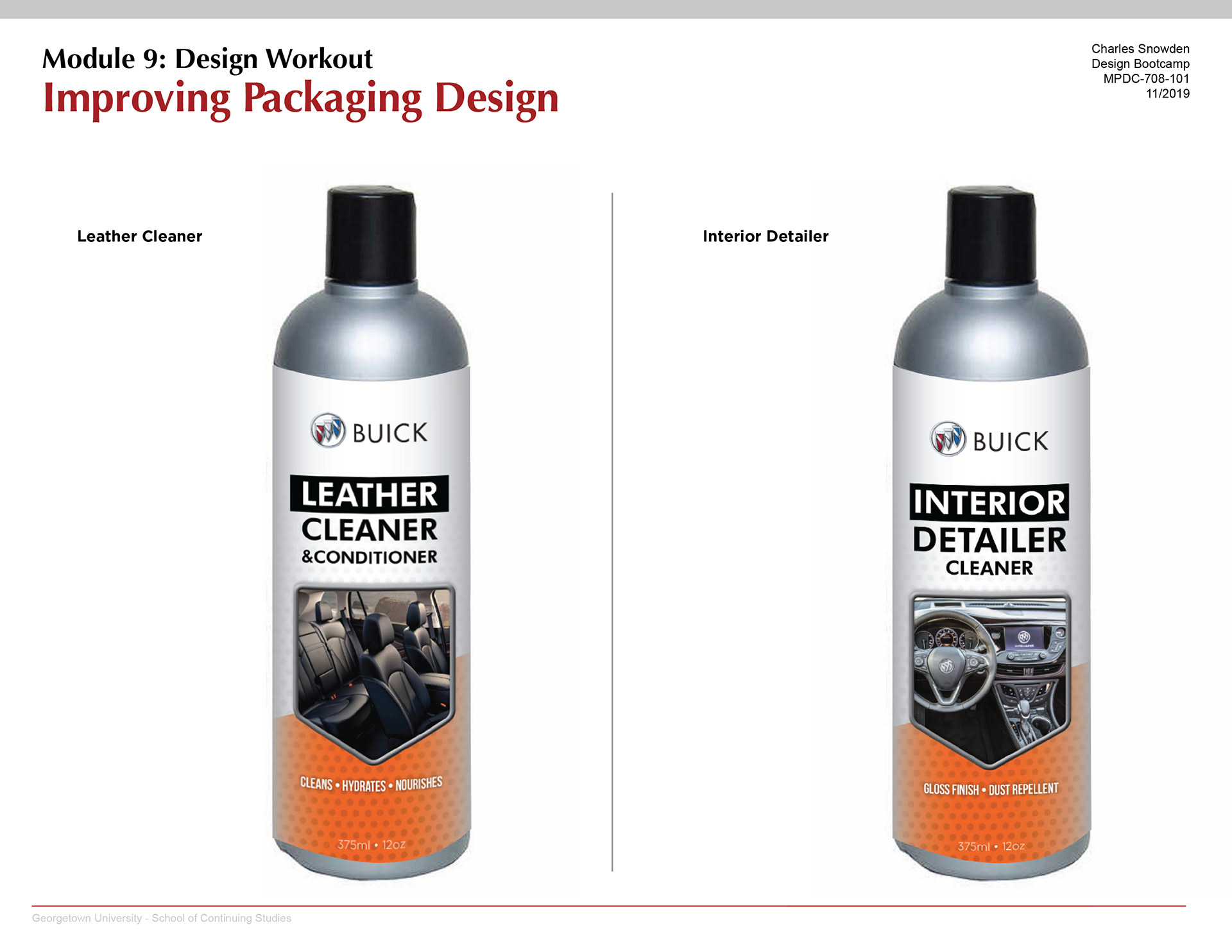
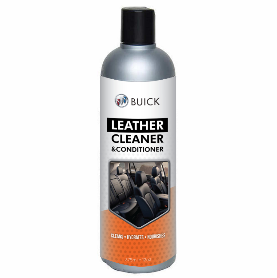
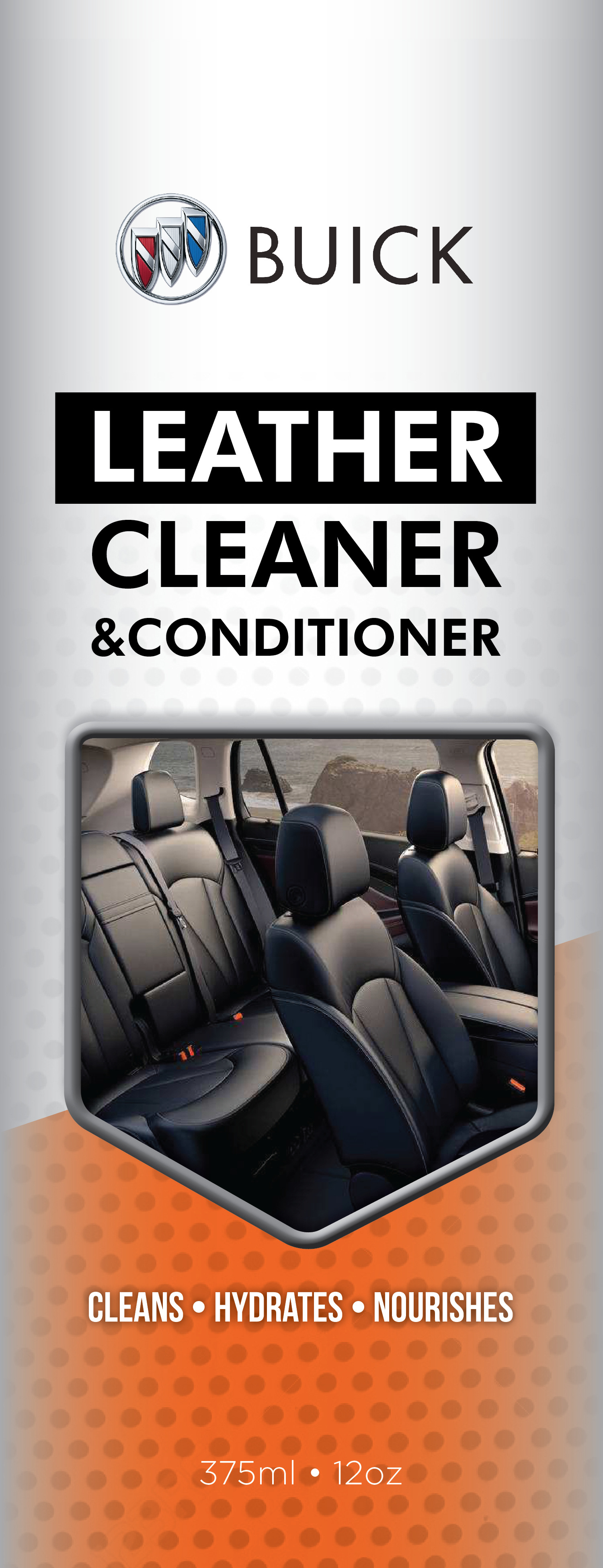
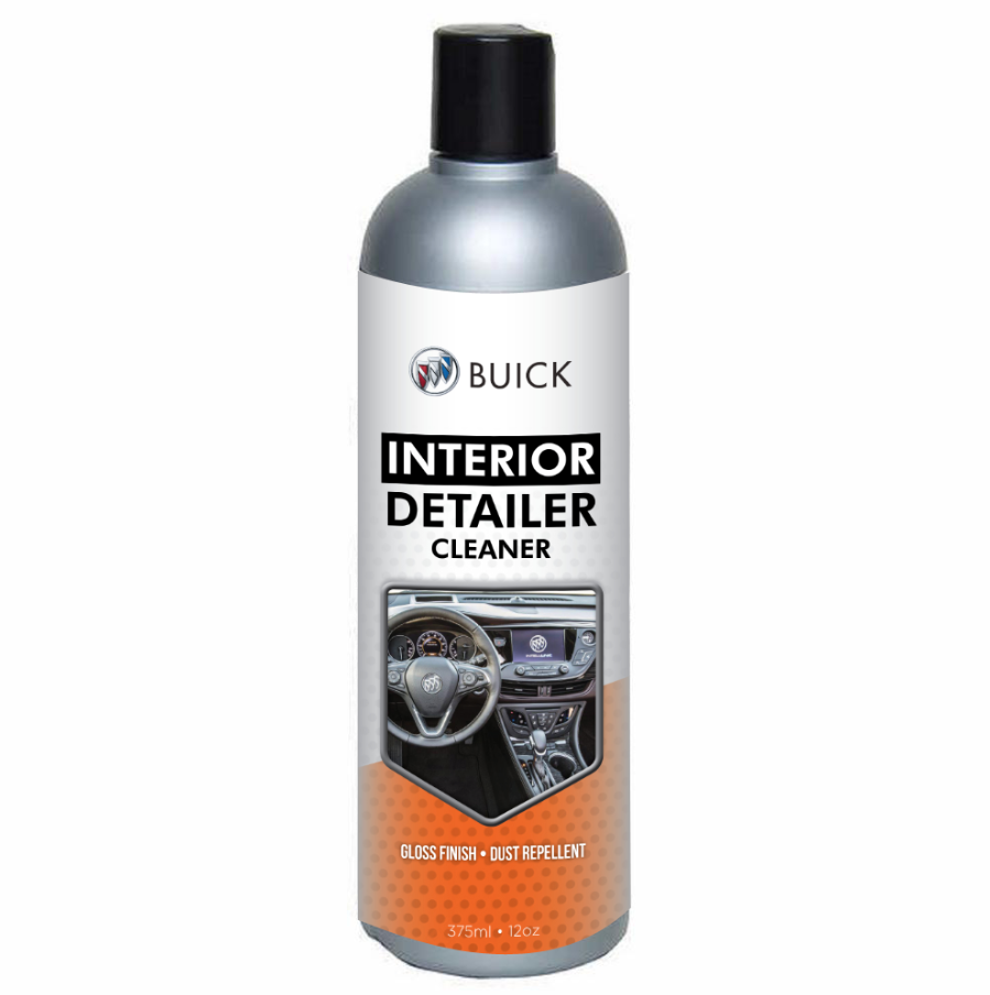
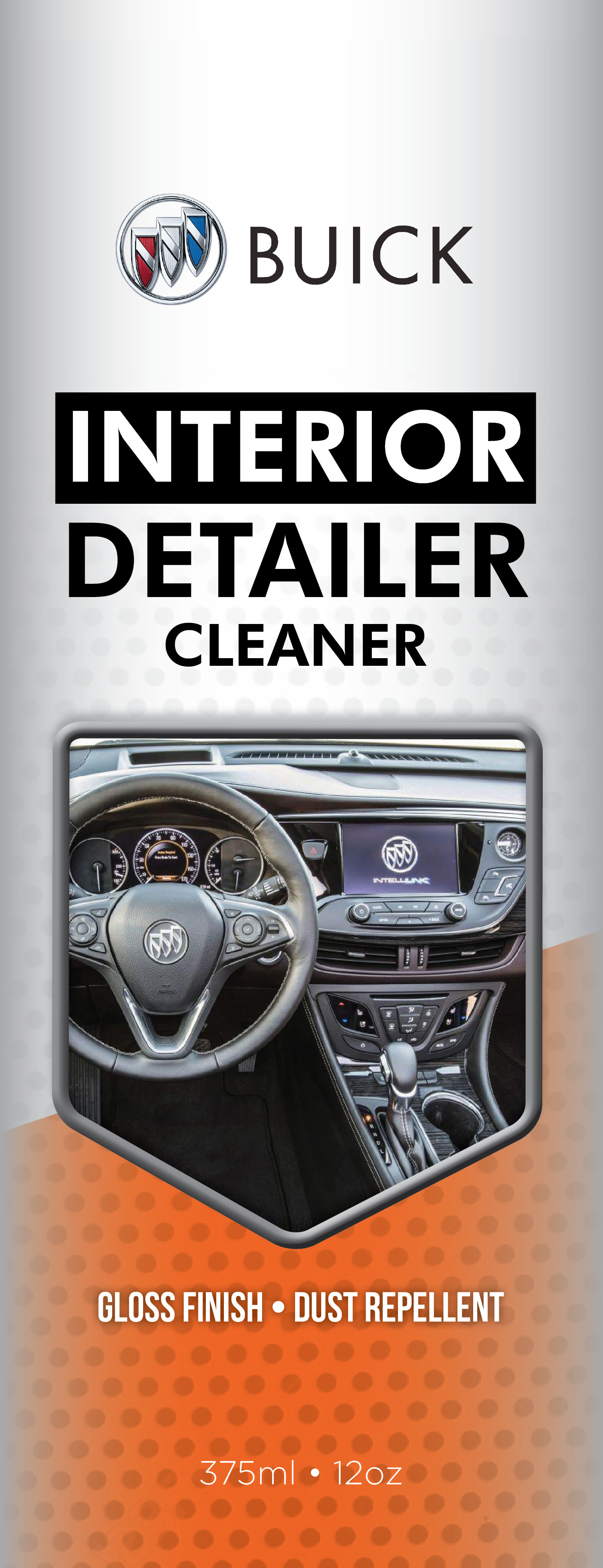
I found out Buick does manuals, brochures, and informational items for car dealerships. I do a lot of interior detailing cleaning. I thought it would be nice if Buick had a line of interior cleaning and detailing products. I designed a few products for cleaning leather and interior detailing. I used the Buick logo on the packaging and a bold sans serif font. The product packaging uses a photo of the interior of the car, to show the consumer where and how the cleaner can be used. My goal was to make the package unique and stand out. For inspiration, I looked at the competitor's package design.
Click the images below for a closer look.
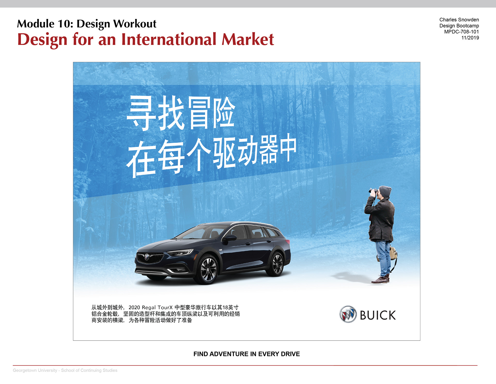
Buick is doing well in China. I noticed on a few ads they broke away from brand guidelines. They seem to be less conservative in China. They really invest a lot into the China market. A lot of the competitor’s car ads are vibrant and colorful. I wanted to do something like their competitors. I took a few elements of their ads and combined them into my ad. I noticed some other China car ads use faded backgrounds behind images of the car.
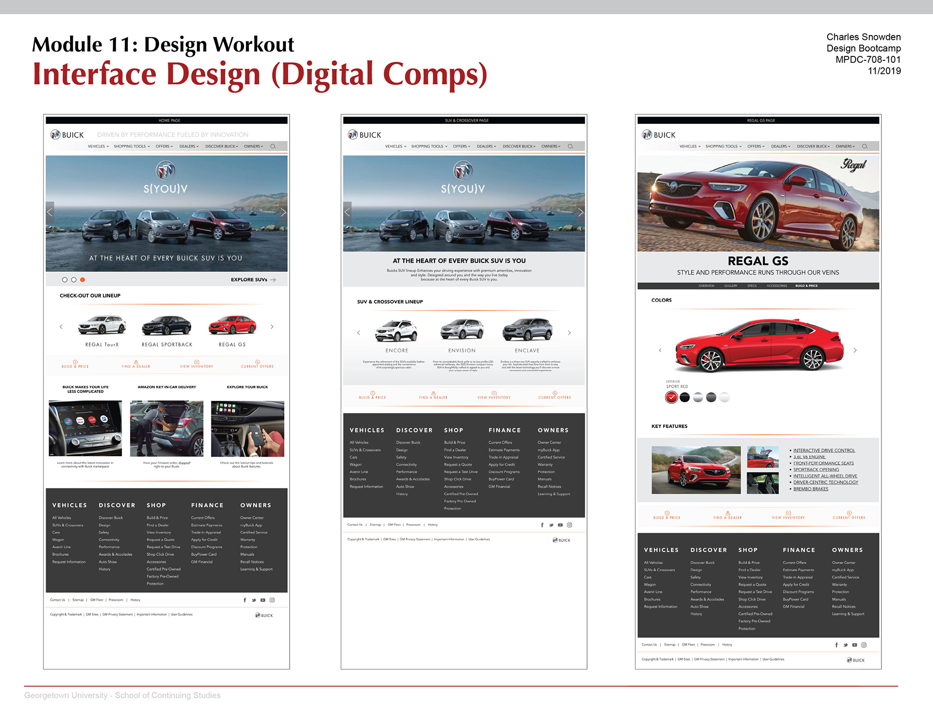
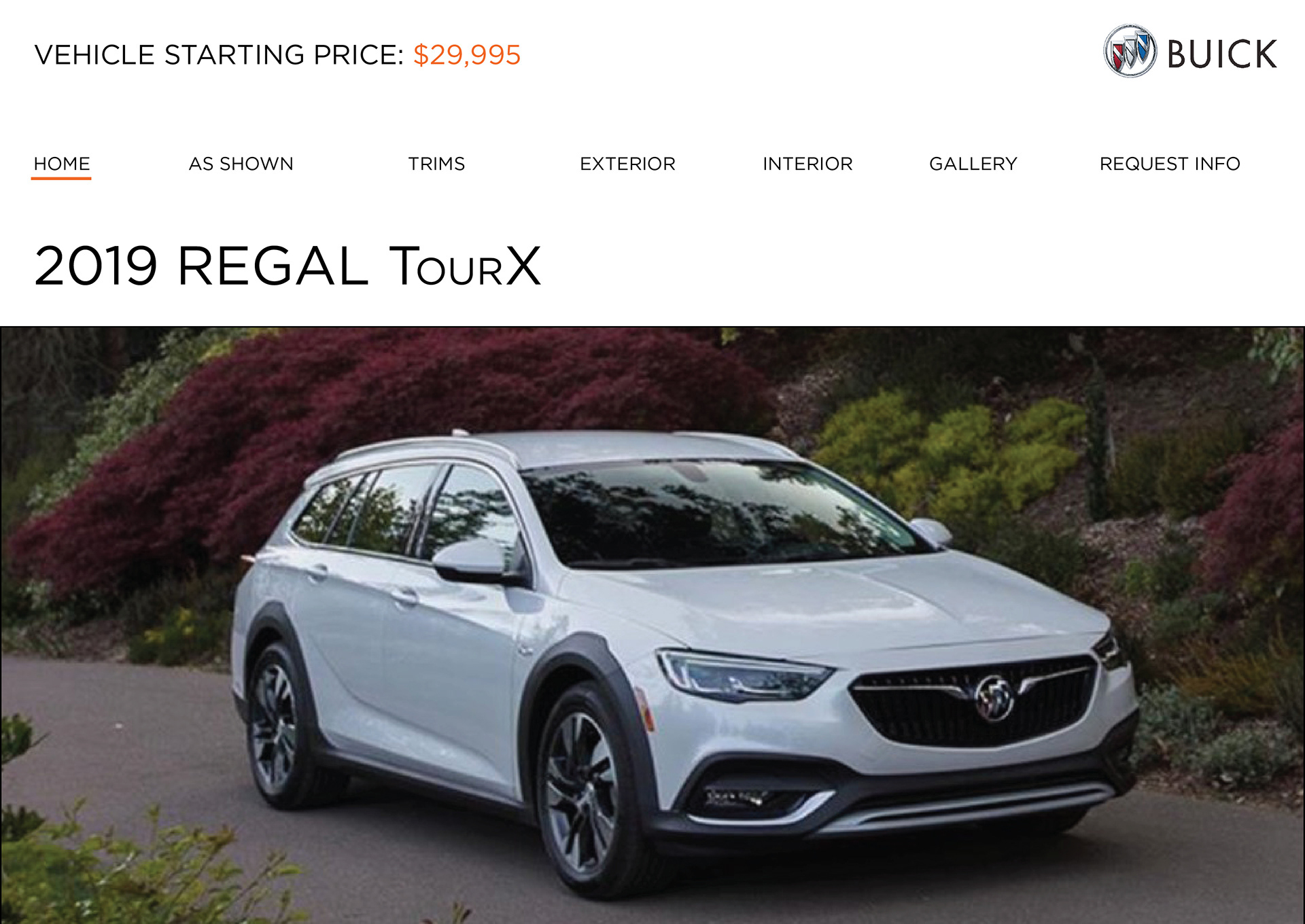
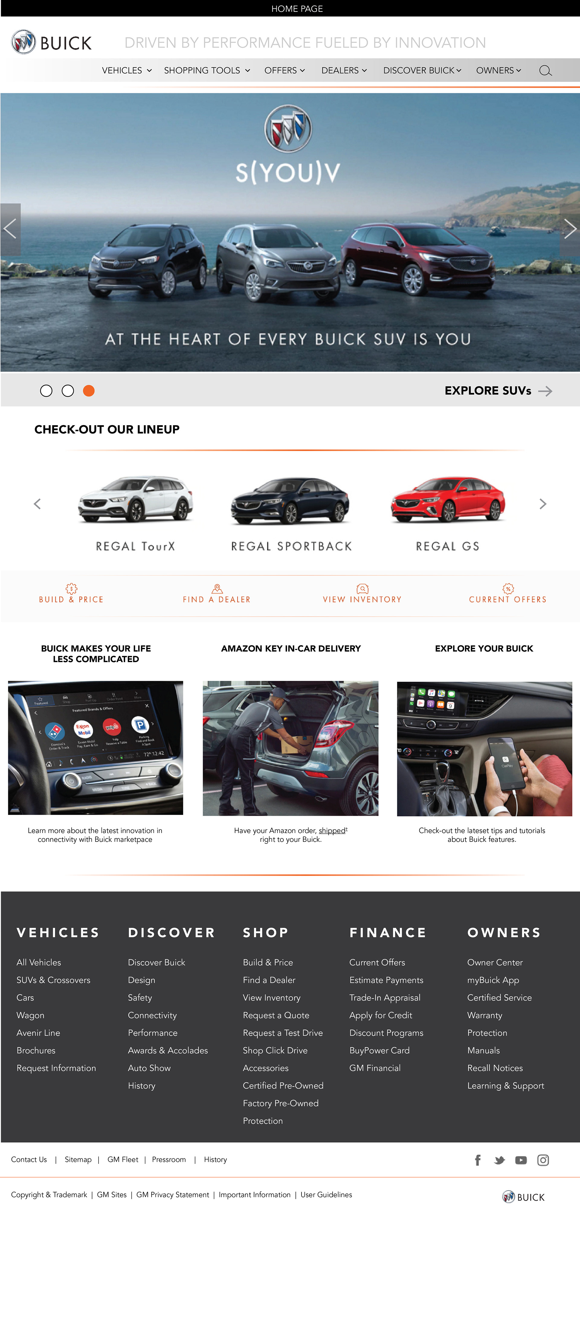
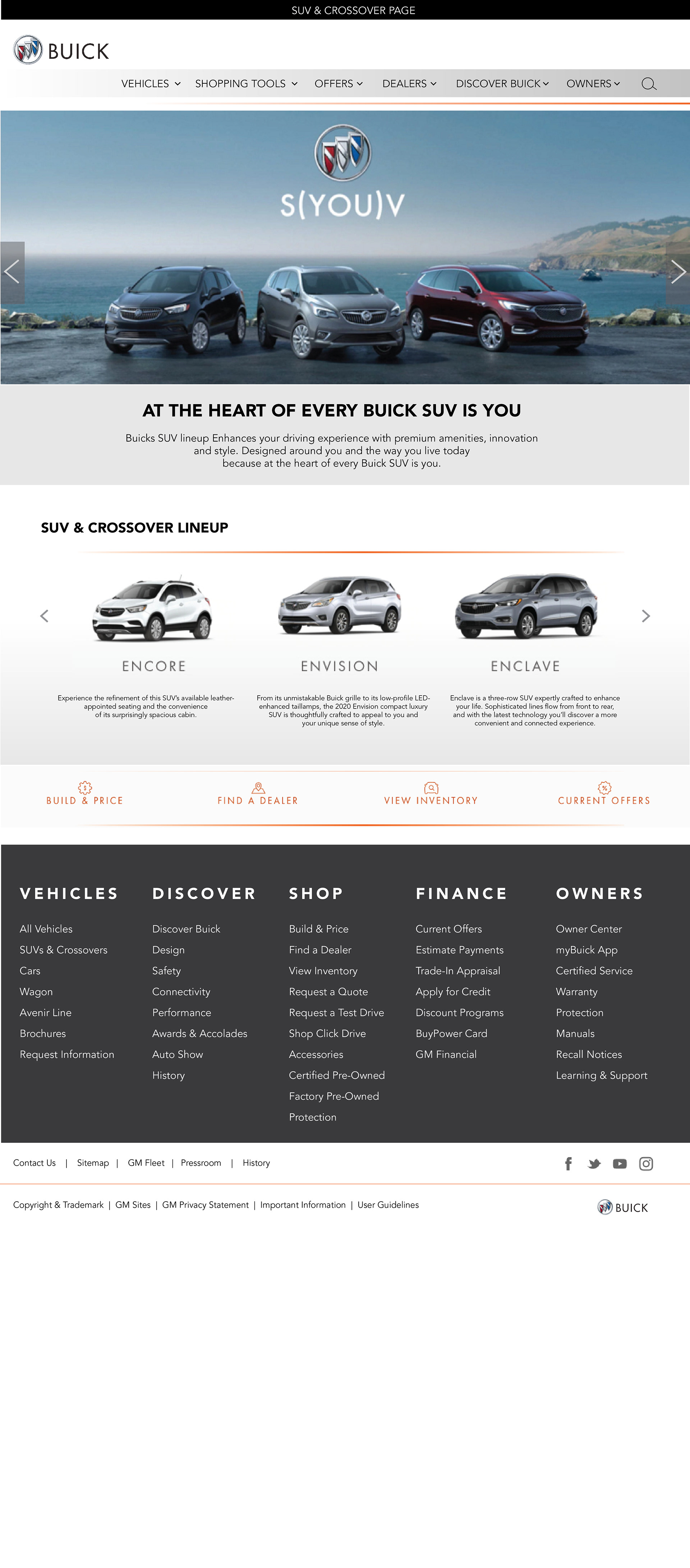
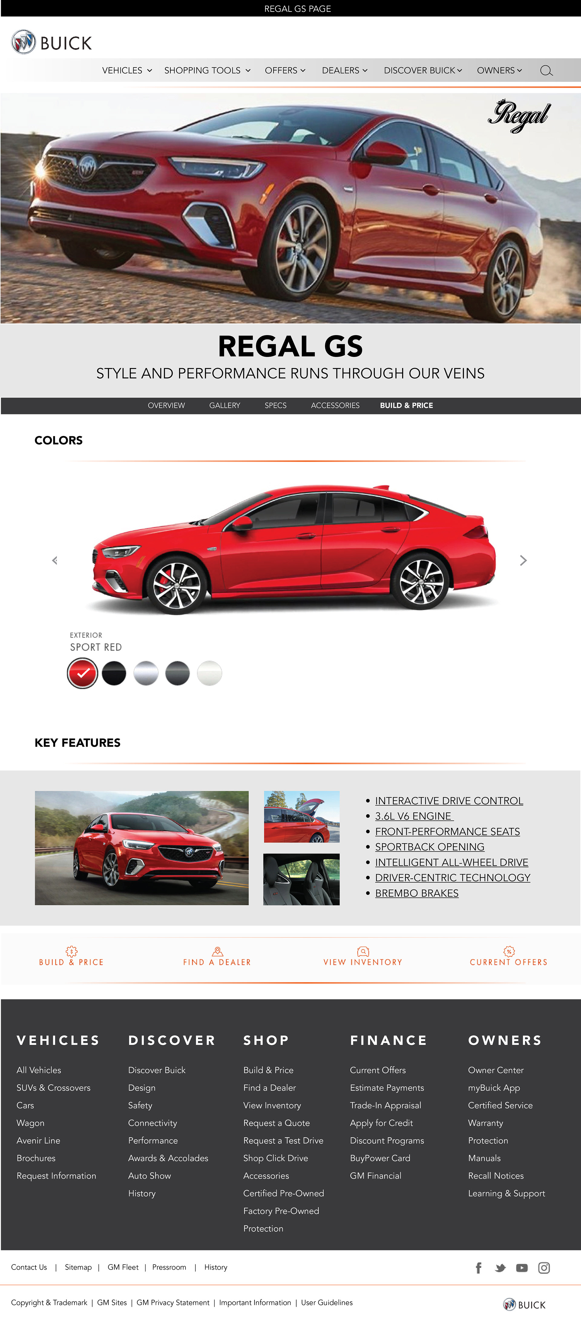
Buick is an affordable luxury and that needed to translate to the website. With my re-design, the website is simplistic, modern, and young. One thing or element that worked on Buick China’s website was the structure. All of the elements lined up and were symmetrical. This was an element that was missing from Buick’s United States website. There was also a lot of unused space on the USA site. On a desktop, the hero image on the home page is almost supposed to take up the full screen. To feel space on the home page I added images towards the bottom. The gray and orange accents on the site were added as an element to break the hierarchy. The secondary pages are more simplified and carry basic elements from the home page such as the menu bars and footer. On the Regal GS page, I used links instead of images for the key features. When the user clicks a link a pop-up window appears with an image.
Click the images below for a closer look.
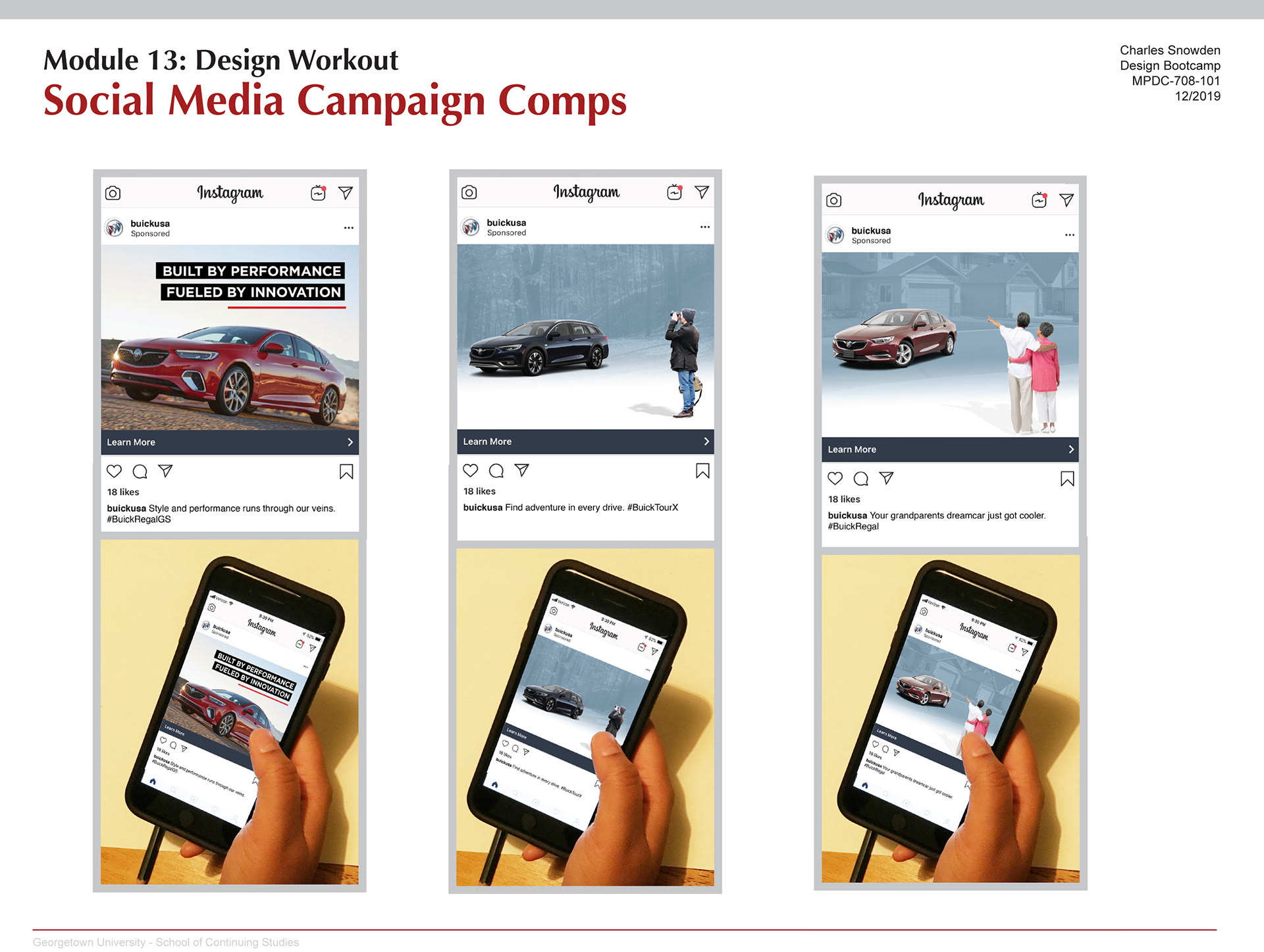
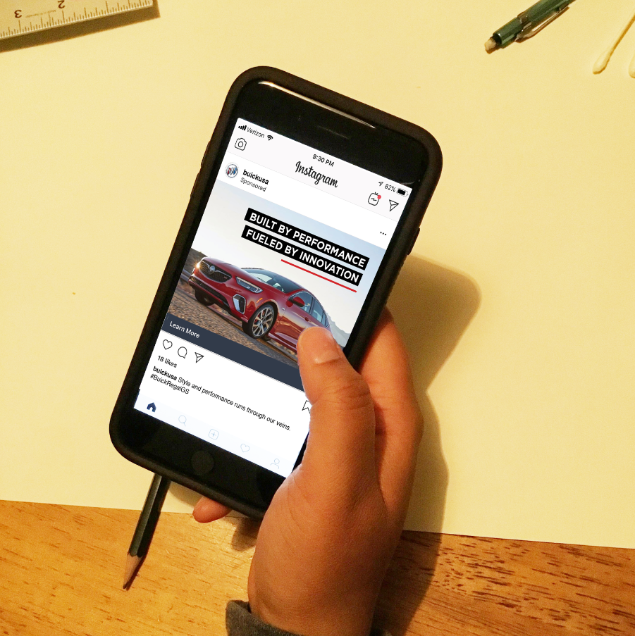
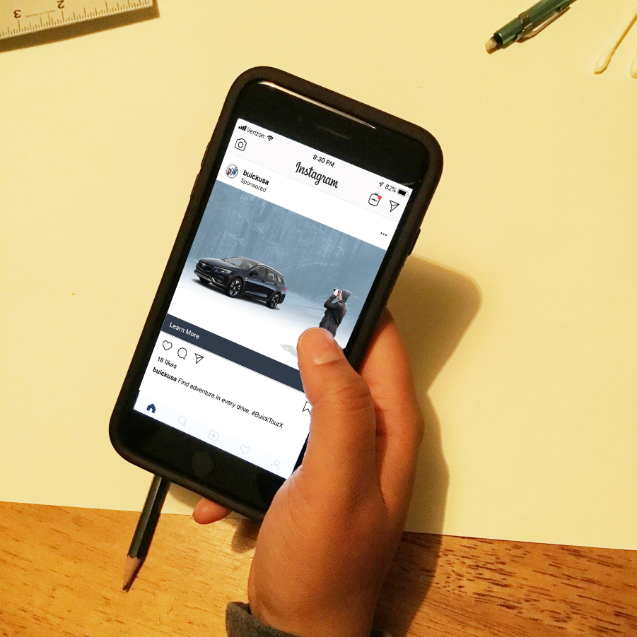
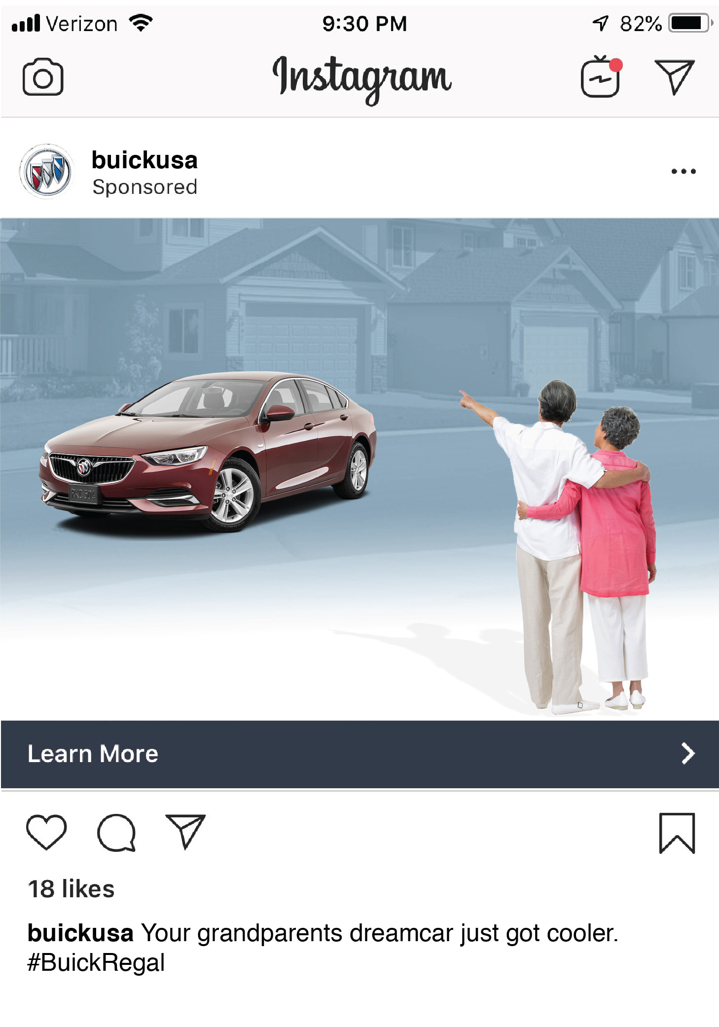
Social media can probably work just as well as television ads. I noticed on social media captions can really promote a brand and connect with the consumers. Buick uses captions to connect to their target market - they are usually one-line sentences. The captions are humorous or famous one-liners with their own spin to them. I focused on using Instagram. I created three different social media campaigns. I wanted the Buick Regal to appear cool to the younger target audience. Instagram is a good platform to promote the Regal. Each ad focuses on different aspects of the car and connects with the target audience emotionally. Down the line, Buick needs to use other social media platforms to create an omnichannel marketing approach each platform would work together to tell a similar story and message.
Click the images below for a closer look.