
Assignment from Instructor: For this assignment, we’ll drive home your skills with visual hierarchy and composition.
List product characteristics, such as softness, that people want from any brand of facial tissues. Think of a brand with those properties.
Focusing on one of those characteristics, determines why people want that characteristic. Why do consumers want soft tissues? This may sound like a silly question, but learning to focus on what consumers want from a brand sets you on the right path for engagement.
Generate an advertising idea based on why consumers want one of those brand characteristics. What happens to people’s noses or faces when tissues are not soft? Would you use rough tissues when you have a cold? Would you use them on a baby?
Think of an image and headline combination that together will communicate your idea. If you can’t think of anything, use a facial feature, such as an eye or nose, and couple it with a headline that does not use the word to describe what we’re seeing. For example, if you depict a nose, don’t use the word “nose” in the headline. Again, the combination of the two—the image and headline—communicates the message cooperatively.
Design directives:
1. Using size, color, and placement, make sure the viewer sees either the image or the headline first.
2. Create an absolutely unequivocal visual hierarchy to direct the viewer’s gaze.
3. You can create the visual hierarchy in a variety of ways. To ensure the viewer sees one thing first, you can:
1. Using size, color, and placement, make sure the viewer sees either the image or the headline first.
2. Create an absolutely unequivocal visual hierarchy to direct the viewer’s gaze.
3. You can create the visual hierarchy in a variety of ways. To ensure the viewer sees one thing first, you can:
----------------------
Characteristics: Softness, Absorbent, Disposable, Smooth, Durable
Brand: Quilted Northern
Brand: Quilted Northern
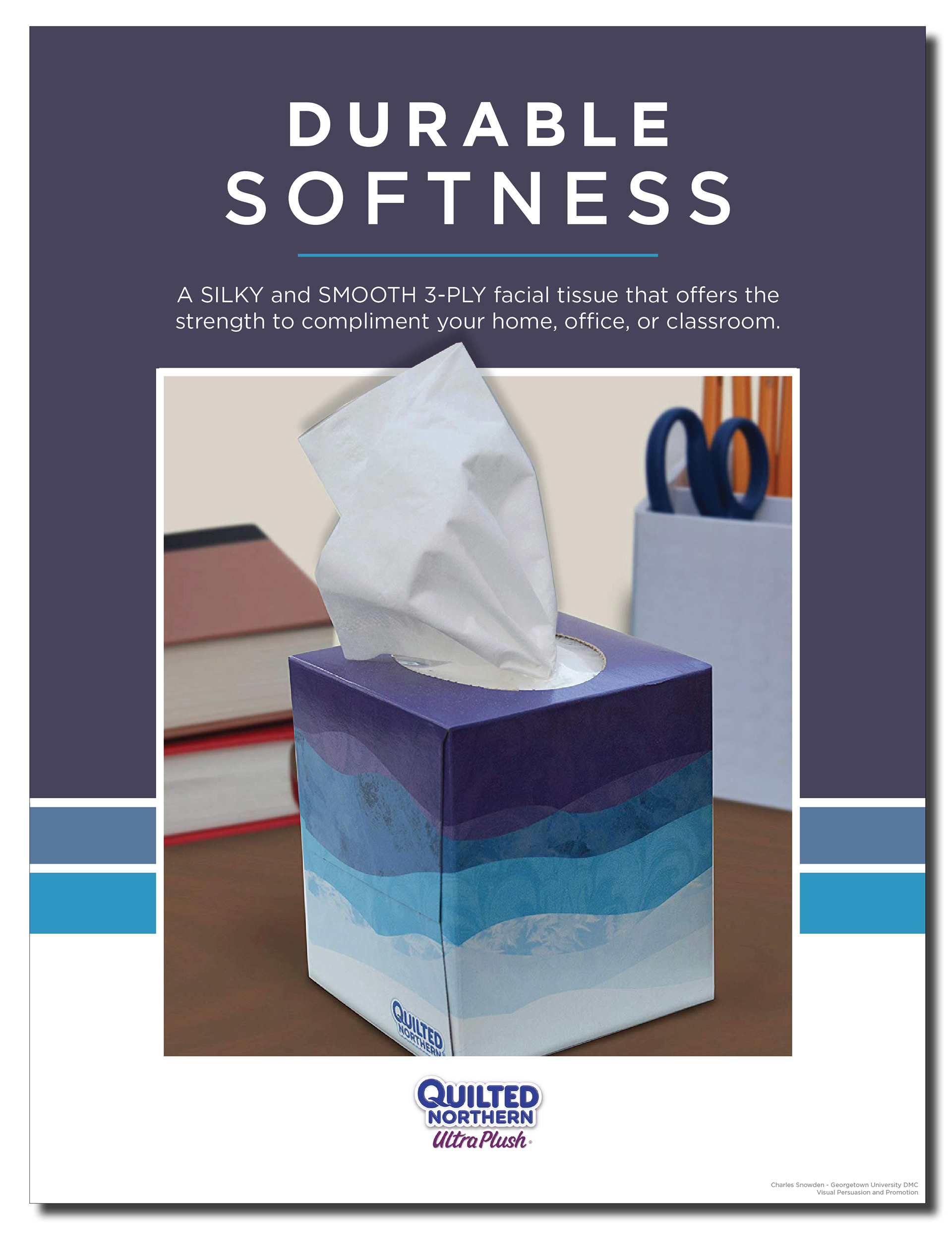
I chose Quilted Northern as a facial tissue brand. This brand is known for making toilet paper. My goal is to get the audience to start at the top of the ad and work their way down. I started with an image of just a box of tissue to show the functional benefits of it being used in the classroom. I made the ad top heavy by adding different elements with a bolder type and different shapes, to draw the viewer’s attention to the top. Placing elements at the top give it balance. I incorporated some colors from the tissue box for repetition. At the same time these colors bring contrast and separation to the ad.
-------------------------------
Visual Persuasion & Promotion (MPDC-610-101) from Georgetown University's Master's in Design Management & Communications